


The single most useful rule: a rug should share a color thread with your wallpaper, not mirror its pattern. Pick one visual hero, let the other surface support it, and keep the whole room to three patterns. That discipline is what separates a curated interior from a busy one.
Quick rules to carry into every room:
- Pull one or two anchor colors from the wallpaper and find them in the rug’s field, border, or accent tones.
- Assign a hero: the bolder, larger-scale pattern leads; the quieter one grounds.
- Limit the room to three distinct patterns total, including soft furnishings.
- Size the rug to anchor the furniture group, not just fill floor space.
Table of Contents
- How do designer rules make rug and wallpaper pairing work?
- Which rug works best for each wallpaper style?
- What rug sizes actually anchor a wallpapered room?
- How do rug fiber and pile interact with wallpaper finishes?
- How do you layer patterns so a room feels curated, not chaotic?
- How do you test pairings at home before committing?
- What are the most common rug and wallpaper pairing mistakes?
- How do you build a moodboard before buying?
- How should rug borders coordinate with wallpaper patterns?
- How do solid color rugs work with patterned wallpaper?
- How does lighting change the way rugs and wallpaper read together?
- Key Takeaways
- Why tension, not matching, is the mark of a collected room
- Bring your rug and wallpaper vision to life with Kevin Francis Design
- Useful sources
- FAQ
How do designer rules make rug and wallpaper pairing work?
The goal is shared color threads, not shared motifs. A wallpaper with warm terracotta botanicals and a rug with a terracotta geometric border read as intentional; the same wallpaper paired with a rug that copies the botanical motif reads as restless. One or two linking tones do the work.
Vary pattern scale and energy deliberately. Equal-scale patterns strip the eye of direction, leaving a room that feels unresolved rather than layered. Pair a large-scale hero with a smaller, quieter supporting pattern, and the composition settles naturally.
Designers often limit a room to three patterns: one hero, one secondary texture or pattern, and one small accent. Beyond three, the space risks feeling disorganized rather than collected.
Decide which plane leads before you shop. If the wallpaper is your hero, choose a rug with lower visual energy. If the rug is the statement piece, let the walls breathe with a textural or tonal covering.
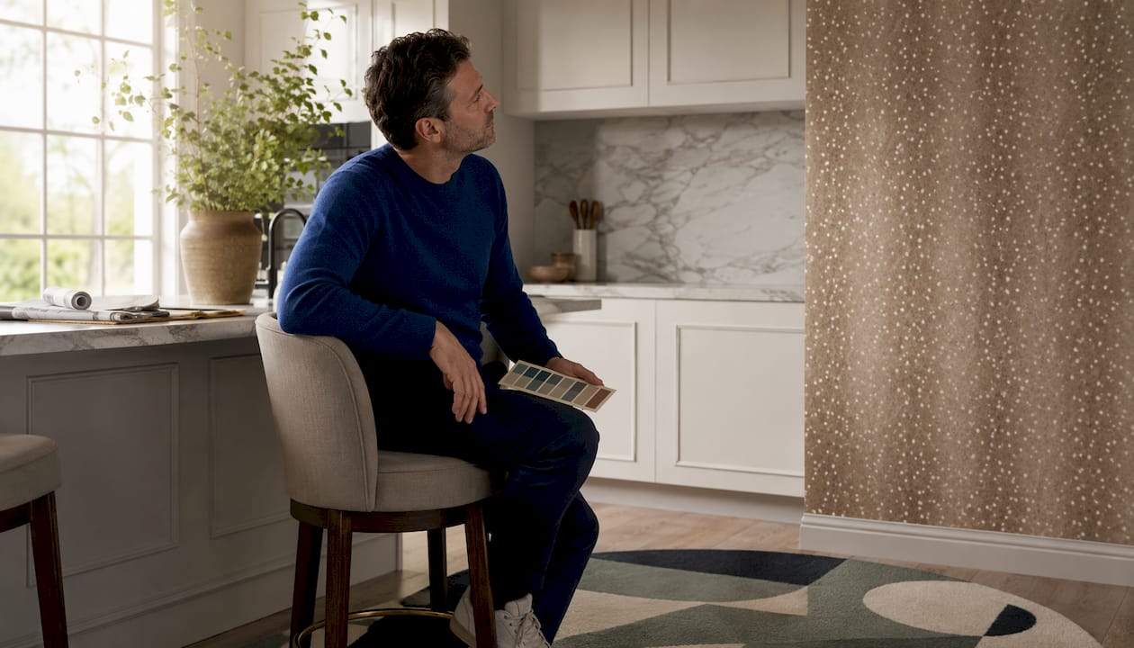
Pro Tip: Introduce a small deliberate tension, curves against a grid, or a bold motif against a quiet stripe. That friction is precisely what makes a room feel curated rather than accidental.
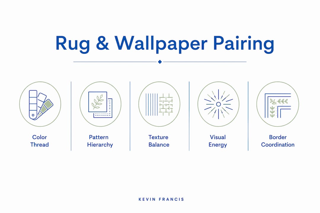
Which rug works best for each wallpaper style?
The pairing logic shifts depending on the wallpaper’s energy and scale. Here is how to read each type:
- Bold botanical or mural wallpaper: Choose a grounding, low-energy rug with a neutral field that picks up one color from the wall. A neutral rug with a tying border reduces competition and gives the eye a place to rest. The wall leads; the rug grounds.
- Geometric wallpaper: An organic or distressed rug softens the room’s angularity. Alternatively, a tonal solid lets the geometry read cleanly without interference.
- Grasscloth or textured wallpaper: If you want contrast, bring in a patterned rug. For tonal warmth, a richer-fiber solid in wool or jute reads beautifully against the wall’s natural weave.
- Small-scale ditsy wallpaper: Use a larger, more graphic rug to create scale contrast. Small repeats can read as texture on a narrow wall; a bold rug gives the floor visual direction.
Pro Tip: When both surfaces carry pattern, keep one large-scale and the other small-scale. One item should dominate; the other provides contrast without competing.
For wallpaper in open-plan spaces, the same rules apply across zones: assign a hero per zone and keep the color thread consistent room to room.
What rug sizes actually anchor a wallpapered room?
Sizing is where many otherwise well-paired rooms fall apart. A rug that floats in the center of a seating group undermines even the most thoughtful color pairing.
- Living room: Front legs of every seat should sit on the rug, with at least 8–10 inches of rug under those legs. An 8×10 is the designer default for most groupings.
- Dining room: The rug must extend far enough for chairs to remain on it when pulled out, typically 24 inches beyond the table edge on all sides.
- Bedroom: The rug should extend 18–24 inches beyond the sides of the bed. Runners on either side should reach at least 2–3 feet past the bedside. For layering rugs in a master bedroom, a base rug sized to the full sleeping zone anchors the room before any accent layer is added.
| Room | Minimum under furniture | Visual breathing room |
|---|---|---|
| Living room | 8–10 inches under front legs | 18 inches between patterned pieces |
| Dining room | 24 inches beyond table edge | 18 inches to walls or adjacent zones |
| Bedroom | 18–24 inches beyond bed sides | 2–3 feet past bedside on runners |
Keep at least 18 inches of visual breathing room between a patterned sofa and a patterned chair. That gap prevents two strong patterns from colliding at close range.
How do rug fiber and pile interact with wallpaper finishes?
Tactile weight matters as much as color. Heavy, textural wallcoverings like grasscloth or woven grass fiber pair naturally with low-sheen, natural-fiber rugs: wool, jute, or a layered wool-jute base. High-gloss synthetics against matte grasscloth create a surface tension that reads as mismatched rather than intentional.
Against metallic or pearlescent wallpapers, choose a matte-fiber rug. A high-pile wool or a flat-woven cotton in a muted tone lets the wall’s shimmer read without competing reflections at floor level.
For high-traffic or food-adjacent rooms near wallpapered dining areas, low-pile wool blends are the practical choice. Wool offers natural stain resilience and a richer visual depth than synthetics, and low-pile surfaces are far easier to maintain. In older homes where dust management is a concern, HEPA vacuums with beater-bar attachments are the recommended tool for rug cleaning without releasing particulates.
How do you layer patterns so a room feels curated, not chaotic?
Assigning roles before you shop prevents the most common layering mistakes.
- Identify the hero. The largest-area, highest-energy pattern in the room takes the lead role. This is usually the wallpaper or the rug, rarely both.
- Choose a secondary pattern. Simpler, lower in energy, and smaller in scale than the hero. An upholstered chair in a medium ikat or a textural throw reads well here.
- Add a small-scale accent. A pillow, a rug border, or a trim color that links back to the hero’s palette. This is the detail that makes the room feel finished.
- Check scale hierarchy. Use large, medium, and small repeats to create visual hierarchy. Dominant pattern repeats of roughly 12 inches or more read as hero-scale; anything smaller supports.
- Test the inversion. Swap the hero and support roles mentally. If the room still works with the rug leading and the wall supporting, you have a flexible, well-balanced composition.
How do you test pairings at home before committing?
- Collect physical swatches of the wallpaper and a rug sample or fabric cutting in the same room.
- Place swatches on the floor and against the wall in natural daylight, then again under the room’s evening lighting.
- Photograph from seated height at the same time of day each session. Undertone clashes that are invisible to the eye often appear clearly in photos.
- Use a room visualizer tool to swap rug colors and preview scale digitally before ordering.
- If a pairing clashes, try one of these quick fixes before starting over:
- Add a neutral runner over a busy rug to mute one surface.
- Replace patterned pillows with tone-on-tone versions to reduce pattern count.
- Introduce a small unifying trim color, a throw or border, that links the rug and wall.
- When no off-the-shelf rug matches, a custom colorway rug from Kevin Francis Design lets you specify the exact linking tones.
What are the most common rug and wallpaper pairing mistakes?
A few errors appear so consistently that naming them directly saves real time.
- Equal-scale patterns competing: Two large-scale patterns on wall and floor remove visual hierarchy. Change the scale of one, or replace one with a solid or textural option.
- Undertone clashes: A warm-toned wallpaper paired with a cool-toned rug creates a color conflict that no amount of styling resolves. Always test swatches under the room’s actual lighting before ordering.
- Rugs that are too small: A floating rug breaks the room’s composition, especially against a strong accent wall. Size up before you consider any other fix.
- Fix sequence: Start by swapping to a solid or low-energy rug, then add a linking accent color, then consider a rug with a grounding border that echoes the wallpaper’s palette.
How do you build a moodboard before buying?
A quick moodboard prevents expensive regrets.
- Extract three anchor colors from the wallpaper: the dominant tone, a secondary, and the smallest accent.
- Place a rug swatch alongside those colors in natural light.
- Add one furniture sample and one lighting sample to see how the full composition reads.
- Use a smartphone photo from seated height to check scale and undertone.
Checklist before committing:
- Undertones match under room lighting (warm with warm, cool with cool).
- Pattern scales contrast clearly (one large, one small or textural).
- One element reads as the clear hero.
- Furniture is anchored, not floating, on the rug.
For wallpaper styles in living rooms, previewing the full wall treatment digitally before ordering saves both time and cost.
How should rug borders coordinate with wallpaper patterns?
A rug border is one of the most underused tools in pattern coordination. When the wallpaper carries a strong motif, a border in one of the wallpaper’s secondary colors creates a visual frame that links floor and wall without repeating the motif itself. Think of the border as a quiet echo rather than a direct quotation.
If the wallpaper features a geometric repeat, a border with a complementary geometric line or a simple banded stripe reads as intentional. For botanical or organic wallpapers, a border in a solid drawn from the foliage’s deepest tone grounds the composition. The border’s width matters too: a narrow border on a large rug reads as a finishing detail, while a wide border on a smaller rug can overpower the field.
How do solid color rugs work with patterned wallpaper?
A solid rug is often the most sophisticated choice against a patterned wall, and it is far more demanding than it sounds. The solid must carry enough visual weight, through fiber richness, pile depth, or color saturation, to hold its own against an active wallpaper. A thin, flat solid in a pale tone will simply disappear.
Choose a solid in one of the wallpaper’s anchor colors rather than a neutral that sits outside the palette entirely. A deep teal solid against a botanical wallpaper that carries teal in its leaves reads as deliberate. A beige solid against the same paper reads as an afterthought. The role of area rugs in spatial design is partly to anchor the room’s color story at floor level, and a well-chosen solid does that with quiet authority.
How does lighting change the way rugs and wallpaper read together?
Lighting is the variable most homeowners underestimate. A rug and wallpaper that look harmonious in a showroom under cool fluorescent light can read as clashing in a warm-lit living room at dusk.
Natural north-facing light reads cool and blue-toned, which can make warm-toned wallpapers appear more muted and cool-toned rugs appear brighter. South-facing rooms flood with warm golden light that enriches warm tones and can make cool-toned rugs look slightly gray. Always test swatches under the room’s actual light source at the time of day the room is most used.
Incandescent and warm LED bulbs amplify amber and red undertones in both rug and wallpaper. If your wallpaper has a warm ivory ground and your rug has a cool white field, that gap widens noticeably under warm artificial light. The fix is simple: test in the evening with lamps on, not just in daylight.
Key Takeaways
Pairing area rugs with wallpaper works when one element leads, the other grounds, and a shared color thread connects them across the room.
| Point | Details |
|---|---|
| Share a color thread | Pull one or two anchor colors from the wallpaper and find them in the rug’s field or border. |
| Vary pattern scale | Keep one pattern large-scale and the other small or textural; equal-scale patterns remove visual direction. |
| Three-pattern limit | Assign hero, secondary, and accent roles; beyond three patterns the room risks feeling disorganized. |
| Size to anchor furniture | Front legs on the rug in living rooms with some overlap; extend well beyond the dining table for chair movement; extend suitably past the bed for comfort. |
| Kevin Francis Design | Offers custom colorway rugs and curated wallpapers so you can specify the exact linking tones when no off-the-shelf option fits. |
Why tension, not matching, is the mark of a collected room
The instinct to match rug and wallpaper exactly is understandable, but it tends to produce rooms that feel more like a showroom display than a lived-in home. What actually reads as sophisticated is a measured friction: a painterly botanical wall paired with a quietly geometric rug, or a bold graphic floor anchored by a tonal, textural wall. The eye needs somewhere to travel, and a room where every surface tells the same story gives it nowhere to go.
The three-pattern rule preserves cohesion precisely because it forces a hierarchy. One element earns the right to be bold; the others serve it. That discipline is what we practice at Kevin Francis Design, where every handmade rug is conceived as part of a larger composition, not as a standalone object. For rooms where a standard colorway simply does not align with a particular wallpaper, our custom design service exists to close that gap with precision.
Bring your rug and wallpaper vision to life with Kevin Francis Design
When the right rug for your wallpaper does not exist off the shelf, a custom colorway changes everything. Kevin Francis Design creates handmade artisan rugs in bespoke colorways, woven to the exact tones your wallpaper demands, whether that is a warm whiskey brown, a cool slate blue, or a soft quartz pink.
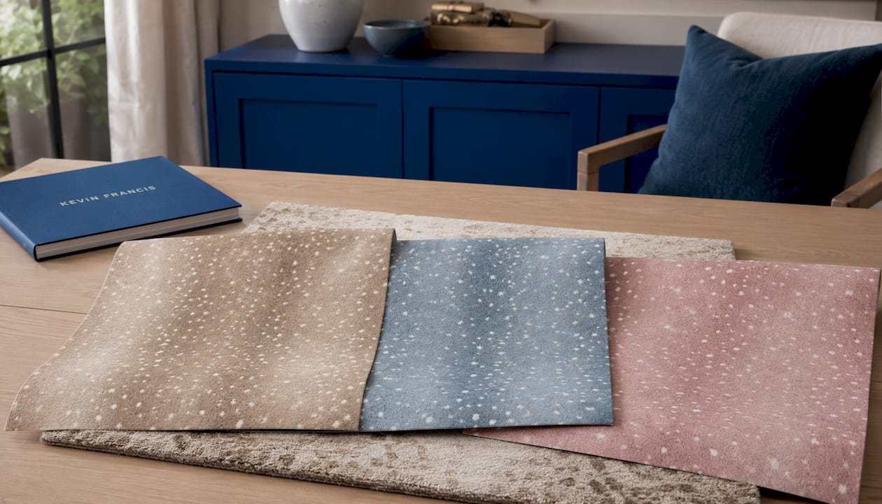
Start by exploring the Wilde Spotted Antelope Hide Wallpaper collection, available in Whiskey Brown, Slate Blue, and Quartz Pink. Each colorway pairs beautifully with a different rug palette, and physical samples are available to test in your own light before you commit. Browse the full collection at Kevin Francis Design and request a custom colorway consultation to find the pairing your room deserves.
Three rugs that hold their own next to wallpaper

Brighton Bamboo Trellis
A trellis on the floor against a floral on the wall is the classic pairing: geometry under botanicals, same scale of repeat. Hand-tufted wool.
From $880
See sizes →

Lucca Maze, Boxwood Green
A solid-color maze reads as texture from across the room, so it lets a busy paper be the star while still doing something.
From $920
See sizes →

Cumulus Cloud Hand-Knotted
Sky blue, hand-knotted Tibetan wool, a soft cloud motif. The rug for a bedroom with a large-scale paper that needs the floor to whisper.
From $1,300
See sizes →
If the wallpaper came from us, the rug will already share its palette: our wallpaper designs and rugs are drawn from the same neoclassical vocabulary.
Useful sources
- The Art of Pairing Wallpaper and Rugs: 16 Combinations We Love, Chris Loves Julia
- Master Pattern Play: Layering Wallpaper and Rugs Like a Pro, Ruggable
- How to Mix Patterns in Dramatic Interiors Without Chaos, Bark and Chase
- How to Pair Rugs with Wallpaper: 5-Step Matching Guide, Walloro
- AI Wallpaper and Accent Wall Designer: How to Preview Patterns Before You Commit, Genroom
- Rug Size Guide: How to Choose the Right Rug, The Modern Home Advisor
- Color Theory and Rug Selection: Your 2026 Expert Guide, Kevin Francis Design
- Area Rug Placement Rules for Your Living Room, Kevin Francis Design
- Custom Colorway Rug Design: A Homeowner’s Guide, Kevin Francis Design
FAQ
What is the simplest rule for pairing a rug with wallpaper?
Share a color thread rather than matching patterns. Pull one or two anchor colors from the wallpaper and find them in the rug’s field, border, or accent tones.
How many patterns can a room handle before it looks chaotic?
Rooms are generally best limited to three key patterns: a hero, a secondary, and an accent. Beyond three, a space can feel disorganized.
What rug size works in a living room with patterned wallpaper?
Front legs of every seat should sit on the rug, with at least 8–10 inches of rug under those legs. An 8×10 is the standard starting point for most seating groups.
Can a solid rug work against a busy wallpaper?
A solid rug is often the most sophisticated choice, provided it carries enough visual weight through fiber richness or color saturation, and its tone is drawn from the wallpaper’s own palette rather than sitting outside it entirely.
When should I consider a custom colorway rug?
When no off-the-shelf rug matches the specific linking tones your wallpaper requires, a custom colorway from Kevin Francis Design lets you specify the exact colors so the floor and wall read as a single, intentional composition.


