


A rug is rarely just a floor covering. Chosen with intention, it becomes the quiet conductor of a room’s entire emotional register, pulling warm terracotta walls into conversation with a slate-blue sofa, or grounding a pale, luminous space with a wash of deep indigo. Color theory is the framework that makes those decisions feel inevitable rather than accidental. At its core, applying color theory to rug selection means understanding how your rug’s hues relate to every fixed element in the room, from the dominant wall color to the undertones in your furniture, and using that knowledge to create a palette that feels both cohesive and alive.
The rug typically occupies the 30% secondary color position in the classic 60-30-10 decorating rule, where walls and major furniture claim the dominant 60% and accent pieces carry the remaining 10%. That middle ground is where color theory does its most nuanced work. A rug in this role must bridge the room’s foundation hues and its accent colors without competing with either. Getting that balance right comes down to a handful of principles: color harmony, temperature, saturation, and the way light transforms every shade throughout the day.
- Color harmony (complementary, analogous, monochromatic, triadic) determines whether a rug creates vibrant contrast or gentle flow.
- Color temperature (warm versus cool) shapes the emotional atmosphere of a room before a single piece of furniture is arranged.
- Saturation controls intensity; a highly saturated rug in a restful bedroom can feel jarring, while a muted version of the same hue feels painterly and calm.
- Coordination with walls, furniture, and lighting ties all three principles together into a selection that holds up across every hour of the day.
What does color theory actually mean for rug selection?
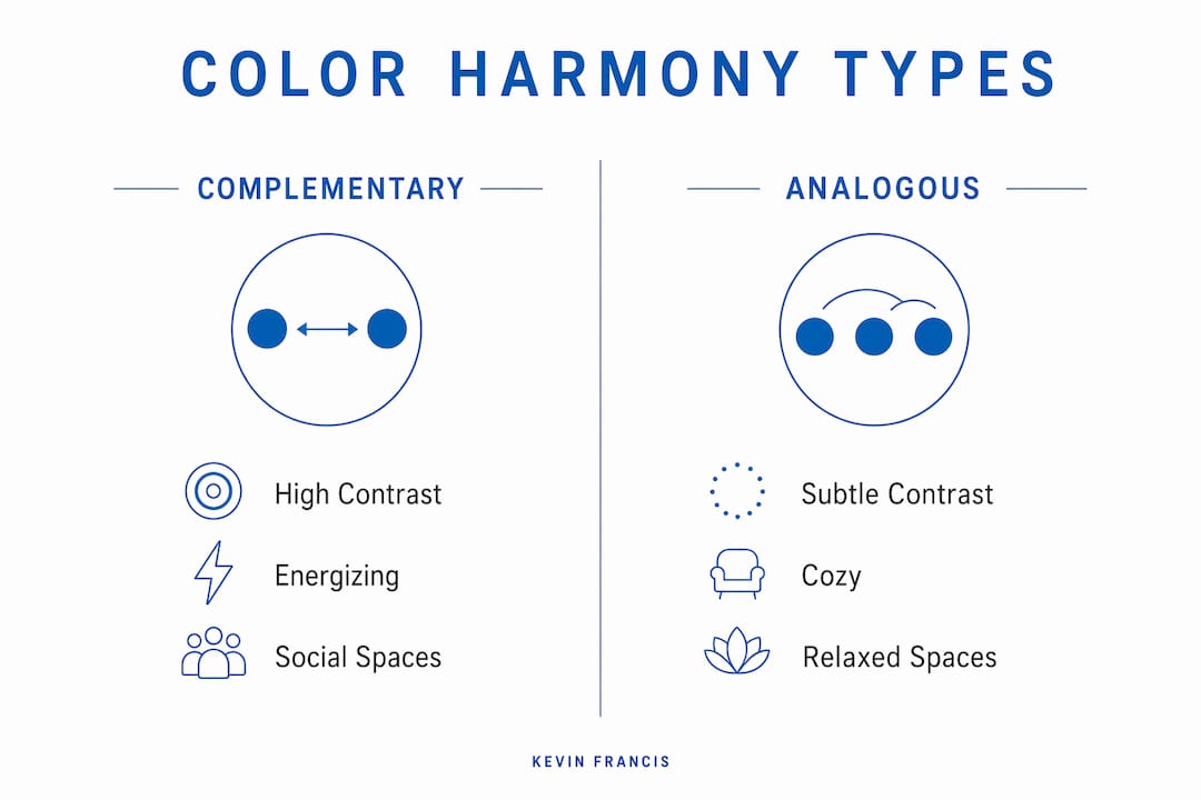
The color wheel, developed from Isaac Newton’s original work and refined through centuries of artistic practice, organizes hues into relationships that predict how colors will interact when placed together. For rug selection, four harmony types matter most.
Complementary harmony pairs colors from opposite sides of the wheel, such as blue and orange, or violet and gold. The contrast is vivid and energizing, which makes complementary rugs powerful focal points. The risk is overstimulation: a large, highly saturated complementary rug in a bedroom designed for rest can feel relentless rather than refined. Reserve this pairing for social spaces where energy is welcome.
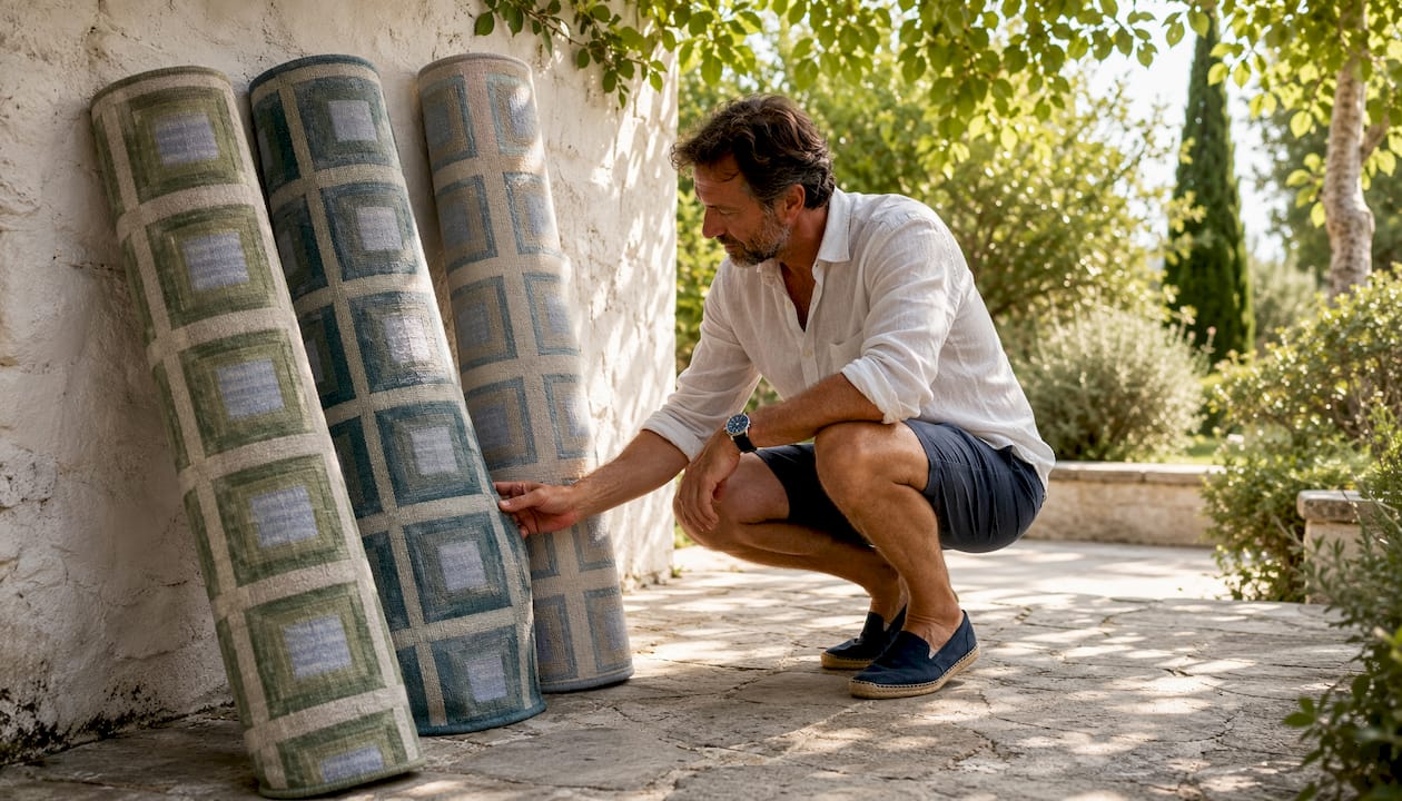
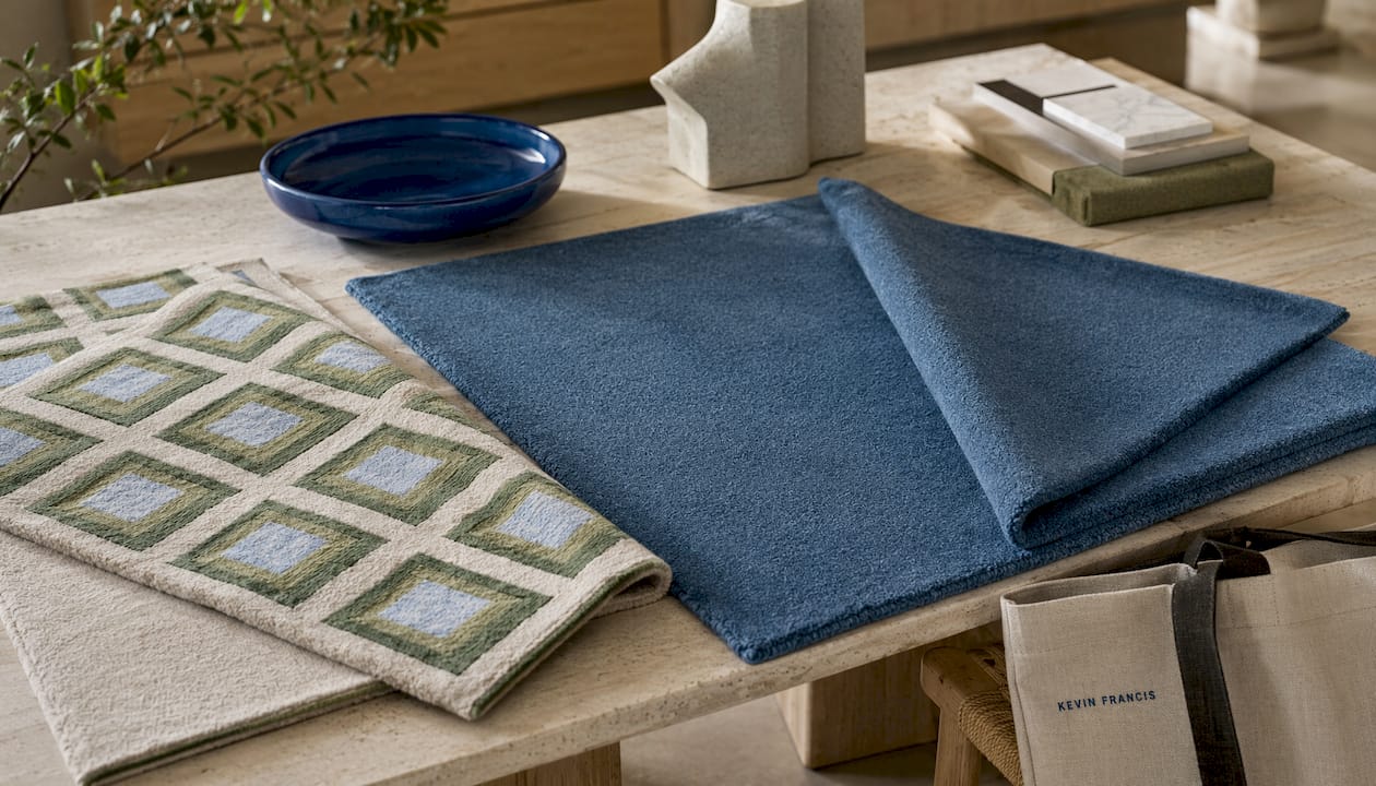
Analogous harmony draws from colors that sit adjacent on the wheel, think sage, teal, and soft blue. These schemes create a natural, flowing quality that reads as effortless in larger rooms. Analogous color schemes are particularly well suited to area rugs because the gentle gradation across hues reads beautifully across a large floor surface.
Monochromatic schemes use varying tones, tints, and shades of a single color. A charcoal rug in a room of soft grays creates layered depth without introducing visual noise. Triadic schemes balance three colors spaced evenly around the wheel, producing a lively palette that requires careful proportion management to avoid chaos.
| Harmony Type | Effect in a Room | Best Used When |
|---|---|---|
| Complementary | High contrast, energizing | Social rooms, bold focal points |
| Analogous | Harmonious, flowing | Larger spaces, calming interiors |
| Monochromatic | Layered depth, quiet sophistication | Minimalist or tonal rooms |
| Triadic | Lively, balanced | Eclectic spaces with varied accents |
Color temperature adds another layer. Warm hues, reds, oranges, terracotta, and golden yellows, raise a room’s perceived energy and intimacy. Cool hues, blues, greens, and soft violets, lower it. Psychology research confirms that blue rugs reduce stress and promote calm, while warm reds increase energy but can also produce restlessness. Choosing a rug’s temperature is, in many ways, choosing the room’s emotional baseline.
How do you read a room’s existing colors before choosing a rug?
Start with the fixed elements: walls, flooring, and large upholstered pieces. These are the colors that will not change when the rug arrives, so they define the palette the rug must work within.
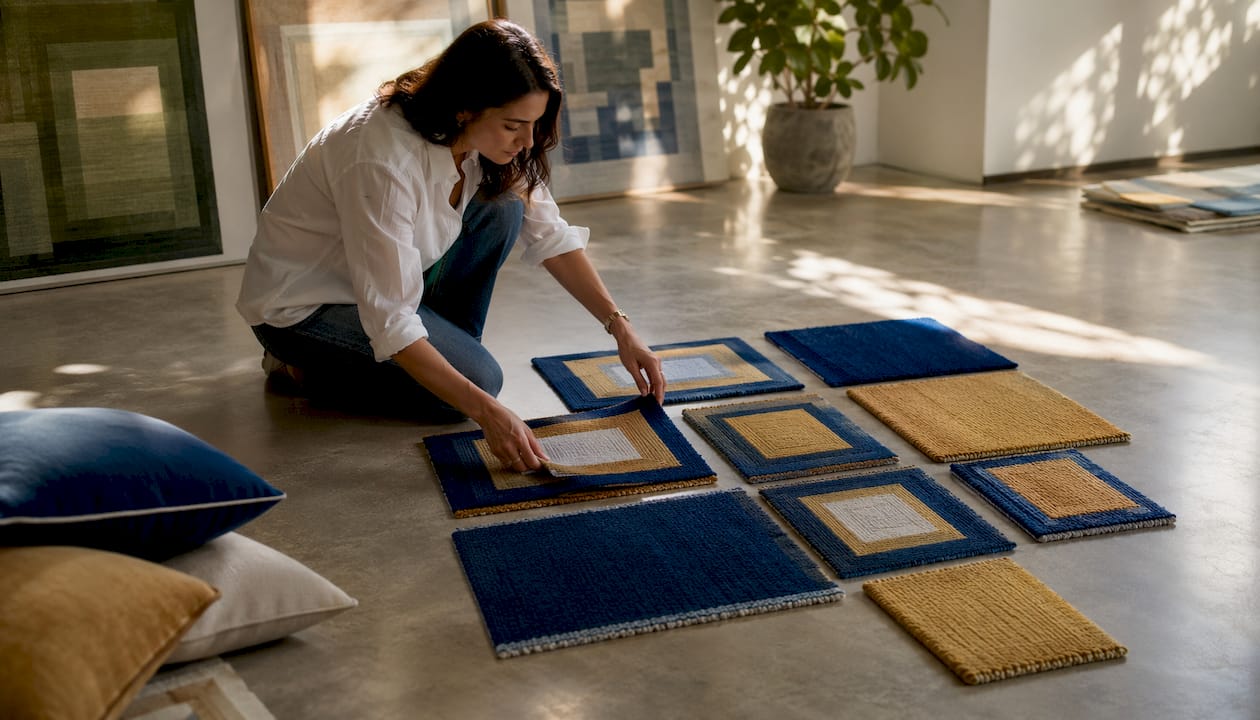
Identify the room’s dominant foundation color first. In most American living rooms, that is the wall color, which tends to be the largest unbroken surface. Then note the secondary anchor, usually the sofa or primary seating. Finally, catalog the accent colors already present in artwork, cushions, and decorative objects. The rug’s job is to bridge dominant and accent colors without simply repeating either.
Undertones deserve particular attention. A beige rug with pink undertones placed beside a sofa with yellow undertones creates a persistent visual tension that is difficult to name but impossible to ignore. Matching undertones across the room’s major elements is what separates a palette that feels cohesive from one that feels almost right.
Here are the most common room scenarios and how color theory guides each:
- Gray walls with neutral furniture: Warm-toned rugs in terracotta, rust, or camel counteract gray’s cool quality. A gray rug on gray walls flattens the room entirely.
- White walls: The rug carries the room’s warmth. Warm neutrals, soft golds, or a patterned rug with both warm and cool tones give the space the grounding it needs.
- Navy or deep-toned walls: Light-colored rugs in cream or warm white create the contrast that prevents the room from feeling heavy. Avoid rugs in a similar dark tone, as the floor disappears.
- Warm beige or cream walls: A deep charcoal or navy rug introduces sophisticated contrast, while sage green or dusty blue adds an accent color that stays within the warm neutral family.
Saturation and contrast levels matter as much as hue. A rug that matches the floor in tone creates a quiet, layered effect where texture does the work. A rug that contrasts with the floor defines the seating area clearly and becomes a visual anchor. Equal tones between rug and furniture tend to flatten spatial definition, which is why choosing a rug noticeably lighter or darker than your sofa almost always produces a more considered result.
Warm colors like terracotta and rust add inviting energy to rooms with neutral backgrounds, particularly when cool-toned walls need counterbalancing. For room function, calming blues suit bedrooms and home offices, while warm hues support dining rooms and social spaces where conversation and appetite are the point.
Expert tips for applying color theory when you choose a rug
Pattern and multi-color rugs offer the most flexibility. A patterned rug containing multiple colors lets you pull any of those hues into cushions, throws, or accessories, and the room will feel cohesive because the rug itself has already established the relationship between those colors. A solid rug in a specific hue is more demanding because every other element must negotiate with that single choice.
Neutral rugs deserve more credit than they typically receive. They function as visual buffers, providing stability that allows bolder accents elsewhere without overstimulating the eye. A neutral rug also supports seasonal flexibility, letting you shift accent colors through cushions and artwork without replacing the rug itself.
Rug material and texture influence perceived color in ways that photographs rarely capture. A deep blue in a thick, hand-knotted wool pile will feel warmer and more enveloping than the same blue in a flatweave construction. Pile height affects how light catches the fibers, which shifts the apparent saturation of the color. Always evaluate a rug’s color in person, or request a sample, before committing.
Pro Tip: Test rug samples in the actual room at different times of day. Lighting dramatically shifts color perception: natural light reveals truer hues, while warm incandescent bulbs enrich reds and yellows, and cool LED lighting pulls colors toward blue. A terracotta that glows at noon can read as muddy under evening artificial light.
- For smaller rooms, lighter rug colors create a sense of openness and visual expansion.
- In large rooms, darker or more saturated rugs ground the space and prevent it from feeling cavernous.
- When the room already carries strong furniture colors, a warm natural fiber rug in jute or sisal keeps the floor quiet while the furniture commands attention.
- For color palettes for rugs in transitional or eclectic spaces, choose a rug that picks up at least one color already present in the room while introducing something the room does not yet have, whether warmth, texture, or contrast.
How Kevin O’Gara of Kevin Francis Design applies color theory to luxury rugs
Kevin Francis O’Gara approaches rug design from the perspective of a painter as much as a craftsman. At Kevin Francis Design, color is never selected in isolation. Each hue in a bespoke rug is chosen in direct response to the room’s existing palette, the quality of its light, and the emotional atmosphere the client wants to inhabit. The custom colorway process at Kevin Francis Design treats color theory not as a set of rules to follow but as a living conversation between the rug and its environment.
At Kevin Francis Design, we believe a rug’s color should feel like it was always meant to be there, as though the room had been quietly waiting for it. We work with the architecture of color relationships, complementary tensions, analogous flows, the way a warm ochre can make a cool stone floor suddenly feel inhabited. Bespoke design gives us the freedom to apply those relationships with the precision that off-the-shelf rugs rarely allow. The result is not just a beautiful object. It is a room that breathes.
This philosophy translates into tangible craft decisions. Kevin Francis Design’s handwoven and hand-knotted rugs are produced using Tibetan knotting and hand-tufting techniques that allow for nuanced color gradation within a single piece, something that machine-made rugs cannot replicate. A wool pile’s natural lanolin gives warm hues a depth and luminosity that synthetic fibers flatten. These material qualities mean that color theory, applied at the design stage, carries through to the finished room with the integrity the original vision intended.
The Color Study Bauhaus flatweave wool rug exemplifies this approach: a handwoven piece in which color relationships drawn from Bauhaus color theory are embedded directly into the textile’s structure, making the rug itself a study in how hues interact across a flat surface.
Common color theory mistakes in rug selection and how to avoid them
Matching the rug to the sofa exactly is one of the most common errors. When the rug and sofa share the same color, the seating area loses definition and the floor blends into the furniture. The rug and sofa can share undertones without matching; a warm beige sofa works beautifully with a warm camel rug, but a beige rug under a beige sofa tends to erase the spatial layering that makes a room feel designed.
Choosing a gray rug for gray walls compounds the problem rather than solving it. Gray absorbs light, and a gray rug in a gray room produces a flat, colorless effect. The fix is almost always a warm-toned rug that counteracts the cool quality of the walls.
Ignoring undertones creates the “almost right” problem. A rug that looks correct in the store can feel persistently off at home because its undertones clash with the room’s existing palette. Always evaluate undertones alongside the room’s fixed elements, not in isolation.
Oversaturating a calm room with a large, intensely colored rug disrupts the atmosphere the space was designed to create. A highly saturated rug works in a social or dining room; in a bedroom or reading room, a muted version of the same hue preserves the restful quality the space needs.
Neglecting lighting conditions before purchasing is perhaps the most avoidable mistake. A rug’s color under a store’s fluorescent lighting is not the color it will be in your north-facing living room at 4 PM in january. Request samples, bring them home, and observe them across a full day before deciding.
Finally, choosing a rug without considering room size undermines even a well-reasoned color choice. A luxury living room rug in a deep, saturated hue can be magnificent in a generous room and overwhelming in a compact one. Scale and color intensity must be calibrated together.
The CHROMA solid color wool rug and its custom-sized counterpart from Kevin Francis Design address this directly: refined, single-hue wool rugs available in sizes calibrated to the room, so the color’s weight is always proportionate to the space it inhabits.
Key Takeaways
The most effective approach to rug color selection applies color harmony, temperature, and saturation in direct response to a room’s fixed elements, its walls, furniture, and light.
| Point | Details |
|---|---|
| Use the 60-30-10 rule | The rug typically carries 30% of the room’s color; choose its hue to bridge dominant and accent tones. |
| Match undertones, not just hues | Mismatched undertones between rug, sofa, and walls create persistent visual tension even when colors seem close. |
| Test samples in real light | Natural and artificial light shift color perception significantly; always evaluate samples in the actual room at different times of day. |
| Calibrate saturation to room function | Calming rooms need muted hues; social spaces can carry richer, more saturated color without overstimulation. |
| Patterned rugs offer palette flexibility | A multi-color patterned rug establishes color relationships across the room, making accent coordination considerably easier. |
FAQ
How do you determine what color rug to get?
Start with the room’s fixed elements: wall color, sofa, and flooring. Choose a rug that picks up at least one color already present while introducing something the room lacks, whether warmth, contrast, or texture. The 60-30-10 rule positions the rug as the room’s secondary color, bridging dominant and accent hues.
Should your rug be lighter or darker than your furniture?
A rug that is noticeably lighter or darker than your furniture maintains the contrast needed to define the seating area. Equal tones between rug and sofa tend to flatten spatial definition, making the furniture and floor read as a single undifferentiated surface.
What carpet colors feel dated in 2026?
Highly uniform, single-tone beige wall-to-wall carpeting reads as dated because it eliminates the layering and contrast that contemporary interiors rely on. Overly matchy rugs that replicate the sofa color exactly also feel static rather than considered.
Should your carpet be lighter or darker than your walls?
Neither rule is absolute, but contrast between the floor and walls generally produces a more dynamic, layered room. A rug lighter than dark walls prevents the room from feeling heavy; a rug darker than pale walls grounds the space and defines the seating zone.
Recommended
- Custom Colorway Rug Design: A Homeowner’s Guide – Kevin Francis Design
- Statement Rug Styles for Luxury Interiors: 2026 Guide – Kevin Francis Design
- Luxury Rug Buying Guide Checklist for Homeowners – Kevin Francis Design
- The Art of Choosing the Perfect Area Rug: More Than Just Floor Coverin – Kevin Francis Design


