
Custom colorway rug design is the practice of selecting and coordinating a specific palette of colors for a handmade rug, matched precisely to your home’s existing interiors. The industry term you’ll hear from designers is “bespoke colorway,” and it refers to far more than simply picking a favorite shade. It means specifying exact hues, often referenced against standards like Pantone, Farrow & Ball, or RAL, then translating those choices through fiber, weave, and pile to create a rug that feels as though it was always meant to be there. Understanding what is custom colorway rug design gives you the power to treat your floor as a foundational design decision, not an afterthought.
What is custom colorway rug design and why does it matter?
A bespoke rug allows exact size, shape, and color matching to your interiors, creating a level of room cohesion that off-the-shelf options simply cannot replicate. Standard rugs are designed to appeal to the widest possible audience. A custom colorway rug is designed for one room, one client, and one vision.
The core purpose of custom colorway design is creating cohesion across cabinetry, upholstery, and wall colors. Think of the rug as the room’s anchor, the piece that draws every other element into conversation. When that anchor is calibrated to your exact paint color, your sofa fabric, and your architectural finishes, the result feels effortless and intentional rather than assembled.
Personalized area rug styles also carry emotional weight. A rug that mirrors the dusty sage of your linen curtains or echoes the warm amber of your oak floors tells a story about how you live. That kind of specificity is what separates a beautiful room from a truly personal one.
How do rug materials affect color perception?
Material selection is the single most underestimated variable in custom rug design. Each fiber type changes color perception compared to printed mockups, which means the color you approve on screen or paper will look different once woven. Understanding why this happens puts you in control of the outcome.
Here is how the most common fibers behave:
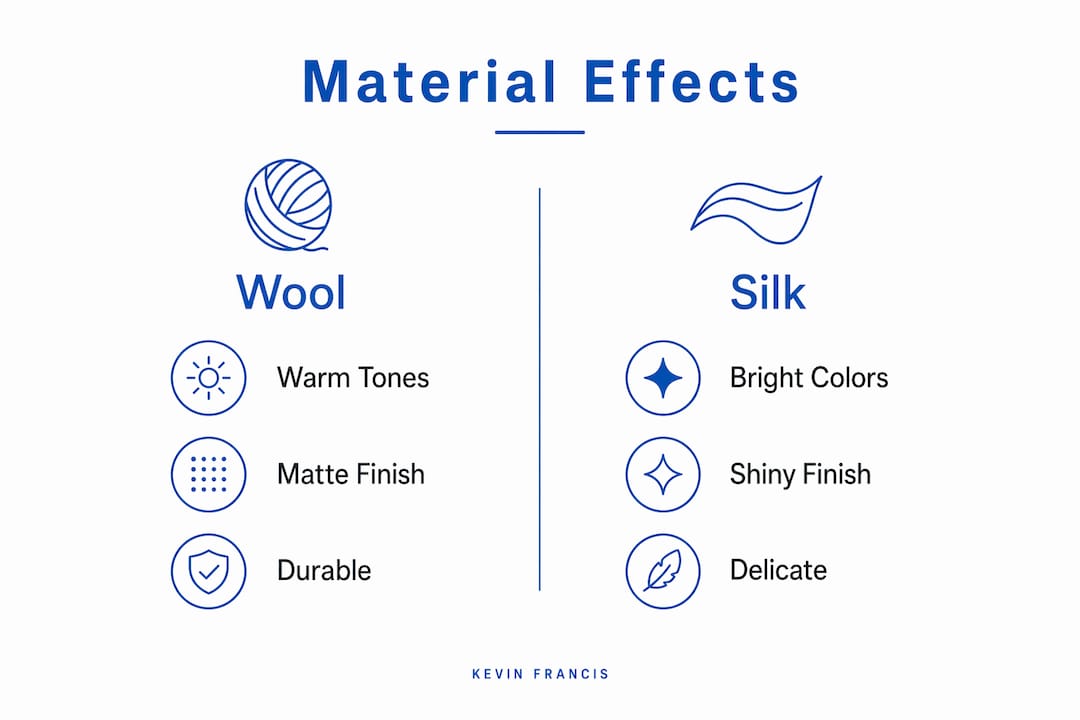
- Wool absorbs light and gives colors a warm, matte depth. A navy in wool reads as rich and grounded. It is also the most durable fiber for high-traffic areas, and its natural lanolin makes it resilient to soiling.
- Silk reflects light sharply, making colors appear brighter and more luminous. A navy in silk can shift toward cobalt depending on the angle of light in the room. Silk is best reserved for low-traffic spaces where its sheen can be appreciated without wear.
- Bamboo silk sits between the two. It offers a gentle luster without the full reflectivity of pure silk, making it a practical choice when you want visual softness alongside moderate durability.
- Viscose has the highest reflectivity of the common rug fibers. Colors on viscose can appear almost metallic in direct light, which creates drama but also means the fiber shows wear and crushing more readily than wool.
The same hue genuinely differs on wool versus silk. This is not a minor variation. It is a fundamental shift in how the color reads in your room, and it must be accounted for before production begins.
Materials chosen also affect durability, texture, and maintenance needs alongside color outcome. A wool rug in a family kitchen will age gracefully. A viscose rug in the same space will deteriorate quickly and lose its color clarity.
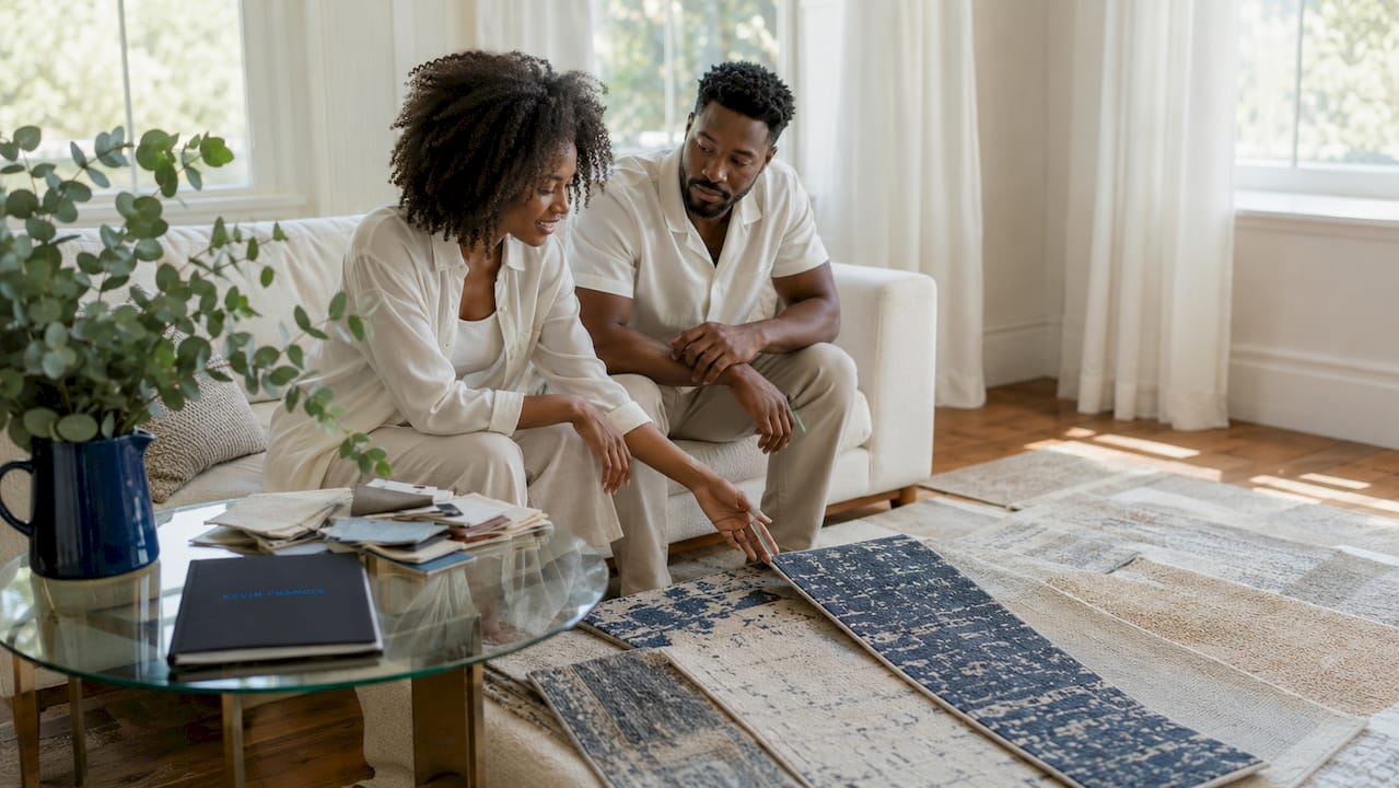
Pro Tip: Request a physical sample swatch in your chosen fiber before approving any colorway. Hold it against your wall paint and upholstery fabric in the actual room, at different times of day, to see how light shifts the color.
How does color matching work in professional rug design?
Precise color matching is what separates a custom colorway rug from a rug that simply looks similar to your decor. Designers use Farrow & Ball, Little Greene, Pantone, and RAL as reference systems because they give dyers and weavers a universal language. When you say “I want the rug to match Farrow & Ball Mole’s Breath,” the production team can work to that specification with confidence.
The process typically moves through these stages:
- Reference gathering: You collect paint codes, fabric swatches, tile samples, and photographs of the space.
- Mood board creation: Mood boards and reference imagery function as a design compass, ensuring the rug supports the room’s atmosphere rather than competing with it.
- Color translation: The design team converts your references into dye specifications for the chosen fiber.
- Sample production: A small sample is woven and sent for approval before the full rug goes into production.
Custom rugs can coordinate colors precisely with paint, fabrics, cabinetry, and architectural finishes. This level of coordination is what creates layered, tonal interiors that feel considered rather than coincidental.
| Color reference system | Best used for | Typical application |
|---|---|---|
| Pantone | Broad design and fashion industries | Matching rug colors to brand or fabric palettes |
| Farrow & Ball | Residential paint and interiors | Coordinating rug hues with wall paint |
| Little Greene | Heritage and period interiors | Softer, historically informed palettes |
| RAL | Architectural and industrial finishes | Matching rugs to cabinetry or metalwork |
The interplay between paint, fabric, and rug color is where the real artistry lives. A rug that picks up the secondary color in your wallpaper, for example, creates a jewel-box effect that rewards close attention.
How does rug construction affect the final colorway?
Construction technique determines how your chosen colors actually read once the rug is finished. High pile height and weave density increase color saturation and depth in hand-knotted rugs compared to tufted or flatweave options. This is not a subtle difference. A deep burgundy in a high-density hand-knotted wool rug will appear almost jewel-like. The same color in a flatweave will read as flatter and more muted.
| Construction type | Color clarity | Pile depth | Durability | Production time |
|---|---|---|---|---|
| Hand-knotted | Highest | Deep | Exceptional | Months to years |
| Hand-tufted | High | Medium | Good | Weeks |
| Flatweave | Moderate | None | Very good | Weeks |
| Machine-made | Variable | Low to medium | Moderate | Days |
Hand-knotted rugs offer high durability and detailed designs, while hand-tufted rugs offer faster production and cost efficiency. For most homeowners pursuing unique rug color combinations, hand-tufted construction offers the best balance of color fidelity, design detail, and realistic lead time.
Weave density also affects how multi-color patterns read. In a low-density weave, adjacent colors can bleed visually into one another, softening transitions. In a high-density hand-knotted construction, color boundaries stay crisp and defined, which is critical for geometric custom rug patterns or detailed motifs.
Pro Tip: Specify your construction technique before finalizing your colorway. A color that looks perfect in a hand-knotted sample may read differently in a tufted version of the same rug. Locking in construction first gives you an accurate color reference point.
How to design a custom colorway rug step by step
Designing a personalized area rug is a process that rewards patience and preparation. Rushing any stage, particularly sampling, is the most common reason homeowners end up with a rug that disappoints.
- Define the room’s color story. Identify the three to five dominant colors already present: wall paint, upholstery, flooring, and any fixed architectural elements like cabinetry or tile.
- Choose your role for the rug. A bold colorway makes the rug a focal point and works best in rooms with restrained surrounding decor. A neutral or tonal colorway offers flexibility and suits multipurpose spaces where the room’s function changes over time.
- Select your fiber. Match the material to both your lifestyle and your color goals. Wool for warmth and durability. Silk or bamboo silk for luminosity in low-traffic rooms.
- Confirm your construction method. Decide between hand-knotted, hand-tufted, or flatweave before you finalize colors. Construction changes how every color reads.
- Build a mood board. Gather paint chips, fabric swatches, and photographs. Use Pantone or Farrow & Ball references to give your designer precise color targets.
- Request a physical sample. Sampling avoids unexpected color shifts from texture and material differences. Approve the sample in the actual room, not in a showroom or on a screen.
- Consider layering. A custom rug layered over a natural fiber base, such as jute or sisal, can introduce warmth and texture without competing with the colorway.
For guidance on balancing bold and neutral palettes in different room types, the rug style guide from Kevin Francis Design offers practical direction grounded in real residential projects.
Working with a designer, rather than using an online configurator alone, adds significant value at the color translation stage. A skilled designer will flag when a chosen color combination will clash under artificial light or when a fiber choice will undermine the palette you have worked to build.
Key Takeaways
Custom colorway rug design delivers superior room cohesion by combining precise color matching, informed material selection, and the right construction technique before a single knot is tied.
| Point | Details |
|---|---|
| Color matching requires standards | Use Pantone, Farrow & Ball, or RAL references to give dyers accurate, reproducible targets. |
| Fiber changes color appearance | Wool reads warm and matte; silk reads bright and luminous; always sample in the actual room. |
| Construction affects color depth | Hand-knotted, high-density weaves produce richer, more saturated color than tufted or flatweave. |
| Sampling prevents costly mistakes | Approve a physical sample in your space before full production to avoid unexpected color shifts. |
| Bold vs. neutral is a room decision | Bold colorways anchor a focal point; neutral tones suit flexible, multipurpose spaces. |
Why I think most homeowners choose their rug color too late
After years of working with clients on bespoke interior projects, I have noticed one pattern that consistently leads to disappointment. The rug is chosen last. The paint is on the walls, the sofa is delivered, the curtains are hung, and then the homeowner tries to find a rug that fits what remains. At that point, the custom colorway process becomes a rescue mission rather than a design decision.
The rugs I am most proud of are the ones where the client came to us at the beginning, with nothing but a mood board and a sense of how they wanted the room to feel. Those projects allowed us to build the colorway from the ground up, pulling a warm terracotta from the architectural brick, a soft gray from the linen upholstery, and a deep teal as an accent that tied the whole room together. The rug became the room’s foundation, not its footnote.
There is also a nuance around texture that most homeowners do not discover until they hold a sample in their hands. The same color in wool and in bamboo silk can feel like two entirely different design choices. One grounds the room; the other lifts it. Neither is wrong, but the choice must be deliberate. I always encourage clients to explore how designer rugs tell stories through material and color together, because the two are inseparable.
Rug design trends will come and go. Earthy, tonal palettes are strong right now, and geometric custom rug patterns continue to draw interest from clients who want something architectural underfoot. But the rugs that endure are the ones designed with the specific room in mind, not the trend cycle. Start with your space. Let the colorway follow.
— Kevin O’Gara
Discover Kevin Francis Design’s custom rug collections
At Kevin Francis Design, every rug begins with a conversation about color, material, and the life you want the piece to live in your home. Our handmade rugs are crafted using hand-knotting, hand-tufting, and Tibetan knotting techniques, and each design can be adapted to your specific colorway requirements.
The Lotto hand-knotted wool rug is a strong starting point for anyone exploring bespoke colorway options. Its construction delivers the deep color saturation that hand-knotted wool is known for, and it is available for customization in size and palette. We also offer design consultation and physical samples to help you see exactly how your chosen colors will read before production begins. Explore the full collection at Kevin Francis Design and take the first step toward a rug that was made for your room.
FAQ
What is a colorway in rug design?
A colorway is the specific combination of colors used in a rug’s pattern and field. In custom rug design, the colorway is selected to match the client’s interior palette precisely, often referenced against Pantone, Farrow & Ball, or RAL standards.
How do I choose colors for a custom rug?
Start by identifying the dominant colors in your room, including wall paint, upholstery, and flooring. Build a mood board with physical swatches and paint chips, then work with a designer to translate those references into dye specifications for your chosen fiber.
Does rug material change how colors look?
Yes. Silk reflects light and makes colors appear brighter, while wool absorbs light and produces warmer, deeper tones. Always request a physical sample in your chosen fiber and view it in the actual room before approving the colorway.
How long does a custom colorway rug take to produce?
Production time depends on construction method. Hand-tufted rugs typically take several weeks, while hand-knotted rugs can take months to years depending on size and complexity. Sampling adds time but prevents costly errors.
Can I match my rug to a specific paint color?
Yes. Designers use color reference systems like Farrow & Ball, Pantone, and Little Greene to translate paint colors into precise dye targets for rug production. Providing the exact paint code gives your designer the most accurate starting point.


