


Use one anchor pattern, one supporting pattern, and one solid or texture, all pulled from a single 3-color story, and vary the scale of each print so the eye can tell them apart. That formula is the backbone of nearly every well-dressed sofa or bed you’ve admired in a design magazine.
Two checks confirm you’ve done it right:
- The squint test. Blur your eyes at the arrangement. If the patterns still read as separate shapes rather than a muddy blur, the scale mix is working.
- The oversize insert rule. A cover needs an insert about 2 inches larger to sit plump instead of deflated.
From here, we’ll walk through building the color story, sizing pillows correctly, mixing pattern types, layering texture, arranging the final composition, and refreshing it all by season.
Key Takeaways
Mixing pillow patterns successfully comes down to one repeatable formula: an anchor print, a supporting print at a different scale, and a solid or textured pillow, all pulled from a shared three-color story.
| Point | Details |
|---|---|
| Use the core formula | Anchor pattern + supporting pattern + solid/texture, all sharing a 3-color story. |
| Pull colors from the room | Choose 3 colors from a rug, art, or curtains using a 60-30-10 weighting. |
| Size inserts up | Use an insert about 2 inches larger than the cover for plump, polished corners. |
| Verify with the squint test | Blur your vision; distinct shapes mean the pattern scale mix is working. |
| Start from Kevin Francis Design | Anchor the room with a hand-knotted rug or extra-long lumbar pillow, then build supporting patterns from its palette. |
Table of Contents
- How Do You Choose a Cohesive Color Story for Pillows?
- What Pillow Sizes and Inserts Work Best?
- How Do You Mix Different Pattern Types and Scales?
- Why Add Solids and Textures Between Patterns?
- What Roles Do Anchor, Support, and Neutral Pillows Play?
- Which Fill and Care Choices Keep Pillows Looking Their Best?
- What Do Working Designers Actually Check First?
- How Should Room Style Shape Your Pattern Choices?
- How Do You Add Contrast Without Creating Clash?
- How Do Pillows Connect With Rugs, Curtains, and Upholstery?
- Can You Mix Patterns Outside the Sofa and Bed?
- What Working Designers Get Wrong About Pillow Rules
- Bring the Look Home With Kevin Francis Design
- Sources
- FAQ
How Do You Choose a Cohesive Color Story for Pillows?
Pull three colors directly from something already in the room: a rug’s border, a piece of art, the curtain fabric, or even a streak of color in the wall paint. Designers call this a color story, and it works because it roots your pillow choices in something that already belongs in the space rather than a palette invented in a vacuum. If your living room centers on an area rug with warm terracotta and ink blue tones, those two colors plus a neutral become your working palette.
From there, apply the 60-30-10 weighting:
- 60% neutral. Your dominant tone, usually the sofa or bedding color, sets the backdrop.
- 30% main color. One of your pulled colors shows up as a mid-scale supporting pattern.
- 10% accent. The boldest, most saturated color appears in small doses, like piping or a slim stripe.
Every pillow on the arrangement should contain at least one of your three chosen colors, and ideally two, so nothing feels like it wandered in from a different room.
Pro Tip: Take a photo of your palette sources (rug, art, curtain swatch) on your phone before shopping. Screen color reads differently than fabric color, and comparing photos side by side catches mismatches before checkout.
What Pillow Sizes and Inserts Work Best?
Size dictates whether an arrangement looks intentional or thrown together. For a standard sofa, 22 to 24 inch squares work well as back pillows, 20 inch squares suit the front layer, and lumbar pillows typically run 12 by 20 or 14 by 24 inches. Armchairs usually take one 18 to 20 inch square or a single lumbar. Beds scale up: a king can carry 26 inch euro shams behind 20 to 22 inch standards, finished with a lumbar or two.
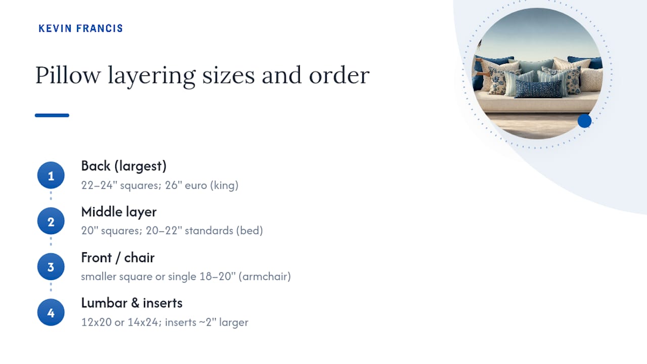
The detail that separates a polished look from a flat one is the insert. Designers routinely size the insert about 2 inches larger than the cover, so a 24 inch cover gets a 26 inch insert. That extra fill rounds the corners and gives the pillow a plush, lived-in shape instead of a flat, sad square.
For layering order, place your largest pillows in back, then step down in size toward the front. A minimal, modern look often uses just three pillows per sofa end; a fuller, collected look might use five or six across the whole piece.
How Do You Mix Different Pattern Types and Scales?
Choose your anchor print first. Designers treat this as the boldest, most multi-colored pillow on the sofa, the piece that sets the roadmap for every other color and pattern decision that follows. Everything else gets pulled from what’s already living inside that one print.
- Pick the anchor. A large floral, an abstract watercolor, or a bold geometric all work, as long as it contains your full color story.
- Add one supporting print at a different scale. If your anchor is large scale, choose a small or medium stripe, check, or dot in a shared color.
- Cap it at two to three patterns total, filled out with a solid or textured pillow so the eye has somewhere to rest.
Organic prints (florals, botanicals, abstract washes) pair naturally against geometrics (stripes, checks, trellis) because the contrast in line quality, curved against straight, keeps both prints legible instead of competing.
Run the squint test once your pillows are in place. Blur your vision slightly: if you can still make out distinct shapes rather than a single visual smudge, your scale separation is doing its job.
Pro Tip: If two patterns feel like they’re fighting, it’s almost always a scale problem, not a color problem. Swap one pillow for a size up or down before you touch the palette.
Why Add Solids and Textures Between Patterns?
Patterns need visual rest stops, and that’s the job of a solid or heavily textured pillow. Designers routinely mix fabrics like linen, velvet, wool, and embroidered surfaces into an arrangement, even when the palette stays tonal, because texture alone can carry visual interest.
Pairings that reliably work:
- Linen paired with velvet for a soft, matte-versus-sheen contrast.
- A chunky knit against smooth cotton for tactile depth.
- A hand-loomed weave beside a printed cotton to bridge pattern and plain.
Space your solids and textures so they break up the patterned pillows rather than clustering at one end. A pattern, a solid, a pattern, a texture rhythm reads far more intentional than two patterns stacked side by side.
Season matters too. Linen and lighter cottons feel right in spring and summer, while velvet and wool bring warmth once fall and winter settle in, all while your core palette stays exactly where it was.
What Roles Do Anchor, Support, and Neutral Pillows Play?
Every well-styled arrangement has three working parts: the anchor (your boldest print), the support (a smaller-scale pattern sharing the anchor’s colors), and the neutral (a solid or texture that gives the eye a place to land). Once you’ve named your anchor, the rest of the arrangement is really just filling in supporting roles around it.
Placement follows a few reliable habits:
- Odd numbers read as collected, not accidental. Three or five pillows tend to look more effortless than two or four.
- Asymmetry works for casual rooms. Two pillows stacked on one end of the sofa and one on the other, plus a lumbar in the middle, gives a relaxed, lived-in feel.
- Symmetry suits formal spaces. Mirrored pairs on either end of a sofa or bed read more traditional and tailored.
Choose asymmetry when you want the room to feel gathered over time, and symmetry when the room calls for more structure, a paneled library or a formal sitting room, for instance.
Pro Tip: Start every new arrangement by laying pillows on the floor in your planned order before you put them on the furniture. It’s much easier to swap a pattern out at that stage than after you’ve fluffed six pillows into place.
Which Fill and Care Choices Keep Pillows Looking Their Best?
Down and down-feel blends compress into soft, sinkable shapes that plump back up with a shake, which is why designers favor them for the loose, collected look most pillowscapes are going for. Synthetic fills hold a firmer, more structured shape, useful for smaller lumbar pillows that need to keep their form against a headboard or armrest.
- Fluff and rotate pillows weekly so the fill doesn’t settle unevenly on one side.
- Air covers outdoors on a dry day every so often to keep fabric fresh between washes.
- Spot-clean fabric pillows rather than machine washing unless the care tag says otherwise, especially for velvet or embroidered surfaces.
- Store off-season covers flat in a breathable bag, not compressed, so they don’t hold a crease.
Seasonal swaps don’t require rebuilding your palette. Swap fabric weight and texture, linen out, wool in, and keep your three core colors exactly as they were. The room still feels like itself, just dressed for the weather.
What Do Working Designers Actually Check First?
Kevin O’Gara, founder and creative director of Kevin Francis Design, builds most interiors starting from a single anchor piece, usually a hand-knotted rug, and lets its palette and pattern language dictate everything layered on top, pillows included.
Two habits worth borrowing directly from that process:
- Treat the rug, not the sofa fabric, as your true starting palette when the two disagree.
- Use one custom lumbar pillow, whether hand-embroidered or made from a favorite remnant fabric, to physically bridge two otherwise unrelated prints in the same arrangement.
Pro Tip: If you own or plan to buy a rug with a strong motif, pull your pillow palette from it before you shop for anything else. It saves at least one round of returns.
How Should Room Style Shape Your Pattern Choices?
A modern room, a traditional living room, and a boho bedroom all call for different pattern logic, even when the underlying formula (anchor, support, solid, three colors) stays the same.
Modern spaces favor restraint. Stick to two patterns maximum, lean on geometric or abstract prints with clean lines, and let a solid velvet or bouclé pillow carry most of the visual weight. Color stories here tend to be tighter, often just two hues plus a neutral, since modern rooms read best when nothing competes for attention.
Traditional rooms can carry more pattern without feeling busy, as long as the prints share a common thread: florals, damasks, and classic stripes in a coordinated color family. Symmetrical arrangements suit this style particularly well, mirrored pairs at each end of a sofa or bed feel tailored and intentional rather than sparse.
Boho interiors thrive on layered, mismatched-on-purpose patterns: block prints, ikats, embroidered textiles, and global motifs in warm, earthy tones. This is the one style where breaking the two-to-three pattern cap slightly is forgivable, since the whole aesthetic depends on abundance. Even here, though, a shared color thread keeps a dozen patterns from reading as clutter instead of curation.
Whatever the style, the anchor-first method still applies. A traditional room might anchor on a chintz floral, a boho room on a hand-blocked textile, a modern room on a bold abstract print. The style changes the pattern vocabulary, not the underlying logic.
How Do You Add Contrast Without Creating Clash?
Contrast is what makes a pillow arrangement feel alive instead of matchy. Clash happens when contrast has no organizing logic behind it. The difference usually comes down to one rule: contrast in scale or pattern type, not in color story.
A large floral against a small geometric check works because the scale differs sharply while the color palette stays shared. Put that same floral against an unrelated geometric in a completely different color family, and the same contrast reads as chaos instead of interest.
A few reliable contrast pairings:
- Curved against straight. An organic botanical print against a crisp stripe or trellis pattern creates tension that stays readable.
- Busy against quiet. A dense, multi-colored print needs a solid or subtly textured neighbor, never two busy prints side by side.
- Warm against cool, within the same family. A rust-toned print can sit beside a muted blue one if both pull from the same three-color story.
Complementary patterns, ones that share a design language even while looking different, tend to be the safest route for a first attempt at mixing. A pillow with a small-scale version of your anchor’s motif, in a different color from the same palette, almost always works because it echoes rather than competes.
If an arrangement still feels off after checking scale and color, the culprit is usually pattern density. Two loud, high-contrast prints sitting shoulder to shoulder will clash regardless of how well the colors technically match. Separate them with a solid, and the same two patterns often resolve themselves instantly.
How Do Pillows Connect With Rugs, Curtains, and Upholstery?
Pillows work best as a bridge between the largest patterned elements in a room rather than an isolated decision. A rug, curtain fabric, or upholstery print is usually the biggest pattern investment in the space, and pillows should echo it, not ignore it or match it stitch for stitch.
Pillows function almost like jewelry for a piece of furniture, small, intentional accents that tie a room’s larger elements together rather than a literal copy of the sofa fabric. That distinction matters. Buying a pillow in the exact print as your curtains often flattens a room rather than pulling it together, because there’s no visual hierarchy left, everything competes at once.
Instead, pull one or two colors from the rug or curtain into a smaller-scale pillow pattern. If your curtains carry a large floral, a small-scale print or solid pillow in one of the floral’s secondary colors will connect the two without repeating the print outright. The same logic applies to upholstery: a patterned sofa should generally carry solid or lightly textured pillows, saving bold prints for a plain sofa or a neutral bed.
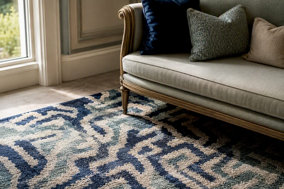
Rugs deserve special attention here since they’re often the room’s true color anchor. A rug with a labyrinth motif or an art-inspired border, like the kind woven into hand-knotted wool designs, can supply an entire pillow palette on its own, saving you from guessing at colors that might clash once daylight hits the room.
Can You Mix Patterns Outside the Sofa and Bed?
The same formula travels well beyond living rooms and bedrooms, though the details shift slightly for each space.
Outdoor seating calls for fade-resistant, often solution-dyed fabrics, but the anchor-support-solid structure still holds. A bold striped or botanical outdoor pillow can anchor a patio sofa, paired with a smaller check and a solid in a weather-resistant canvas. Keep the palette tighter outdoors, since strong sunlight amplifies color saturation and can make an ambitious palette look garish by midafternoon.
Accent chairs usually only have room for one or two pillows, which means the anchor print carries almost all the visual weight. A single bold pillow on a solid chair reads intentional; two competing patterns on a small chair usually reads crowded.
Window seats and benches behave more like mini sofas and can follow the same layering order (large in back, smaller in front), just scaled down proportionally to the seat’s width.
Dining chairs, where used, do best with a single small-scale pattern or solid, repeated identically across each chair, since dining spaces read best with consistency rather than mixed prints chair to chair.
Wherever the space, the rule holds: one anchor, one supporting element, one place for the eye to rest, all inside a color story pulled from something already in the room.
What Working Designers Get Wrong About Pillow Rules
Most advice on mixing patterns treats it like a math problem: three colors, two scales, one solid, done. The formula holds up because it’s genuinely useful, but the conventional wisdom skips the part that actually separates a good arrangement from a great one, which is restraint in editing, not addition.
The instinct most decorators need to fight is the urge to keep adding “one more” pillow to solve a gap that isn’t really there. A sofa with five well-chosen pillows almost always outperforms one with eight mediocre ones, because every extra pillow past a certain point dilutes the anchor print’s authority instead of supporting it. If a rug or a hero pillow is doing real work in the room, let it lead. Everything else should feel like it’s in service of that one piece, not competing for its own spotlight.
The other overlooked detail is texture’s power to rescue a nearly monochrome scheme. Readers chasing pattern mixing sometimes miss that a tonal arrangement, if built from linen, velvet, and a hand-loomed weave, can carry as much visual interest as three loud prints stacked together. Pattern gets the attention, but texture is doing quieter, steadier work the whole time.
Bring the Look Home With Kevin Francis Design
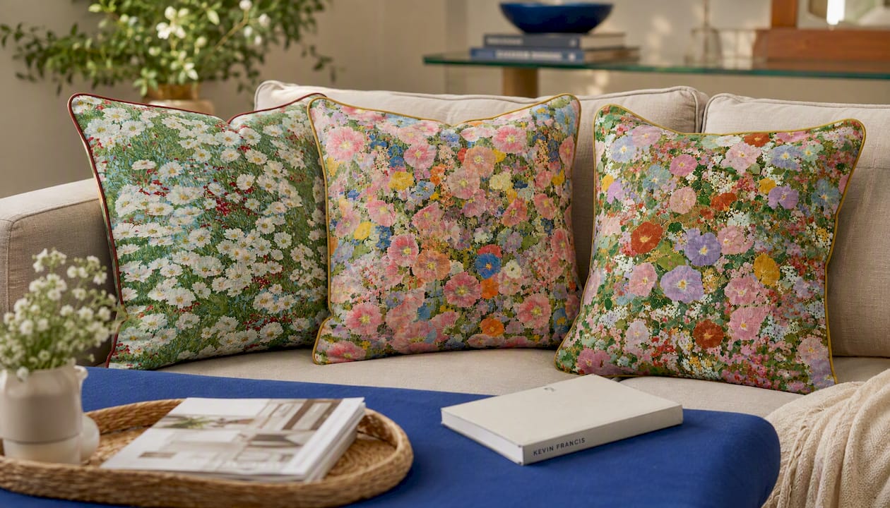
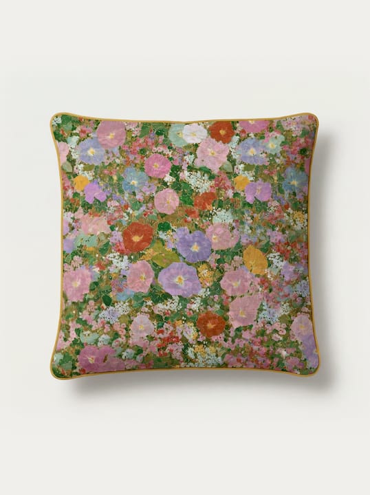
Once you’ve settled on an anchor, the fastest way to execute the formula is to start with a piece built to be one. The Cosmos Meadow Extra Long Lumbar Pillow and The Primrose Meadow Extra Long Lumbar Pillow were designed to carry an entire palette in a single lumbar, floral washes of color that give you an instant three-color story to pull supporting prints and solids from.
If your room’s true anchor should be the rug rather than the pillow, The Talisman Rug, the Selendi Hand-Knotted Wool Area Rug, and the Knossos Hand-Tufted Maze Rug each carry enough pattern and color complexity to build an entire pillow story around, whether you’re drawn to art deco motifs, a labyrinth weave, or a more classic Turkish design. Every rug and pillow in the collection can also be commissioned in a custom size or color palette, so if your room’s colors don’t quite match what’s in stock, Kevin Francis Design’s custom design service can build the piece to your exact story instead of asking you to compromise. Browse the current rug and pillow collection to find your starting anchor and request a custom quote from there.
Sources
- How to mix and match throw pillows — Studio McGee
- How to mix decorative pillows — Emily Henderson
- You’re styling your throw pillows all wrong—here’s how to get it right, according to experts — HouseBeautiful
FAQ
Can You Mix Pillow Patterns?
Yes, mixing patterns is standard designer practice, as long as you cap it at two to three patterns and share a color story across every pillow in the arrangement.
What Is the 2-2-1 Rule for Pillows?
It generally refers to layering two large pillows in back, two smaller ones in front, and one lumbar pillow in the center, a sizing and layering approach rather than a strict color rule.
What Are the Pillow Trends Going Into 2026?
Extra-long lumbar pillows with painterly, art-inspired florals, tonal texture mixing, and custom-commissioned prints are gaining ground over generic matched sets, a shift toward pieces like Kevin Francis Design’s Cosmos Meadow and Primrose Meadow lumbar pillows.
How Do You Mix and Match Pillows Step by Step?
Choose an anchor print first, pull two supporting colors from it, add one pattern at a different scale, finish with a solid or textured pillow, and confirm the mix with the squint test before calling it done.


