


Order three to six physical samples before you buy a single roll, then tape each one to the actual wall you plan to cover and live with it for 48 to 72 hours. Watch how it reads at sunrise, under lamplight, and at dusk. Match the sample format to your real installation, peel-and-stick or traditional paste, and factor in how humid the room gets before you commit to a pattern.
TL;DR:
- Testing large-scale or bold patterns requires requesting bigger samples or memos to see how the design connects across a wall.
- It is crucial to tape samples at actual eye level and observe them under different lighting conditions for at least 48 to 72 hours before deciding.
- Comparing samples side by side on the same wall in consistent lighting helps accurately judge color, pattern scale, and overall room harmony.
- Physical samples reveal texture, sheen, and material behavior more reliably than digital previews, especially for textured or metallic finishes.
- Always consider existing room elements like trim, rugs, and furniture when selecting and pairing wallpaper to ensure cohesion and proper scale.
Table of Contents
- How Do You Order Wallpaper Samples the Right Way?
- How Do You Test Wallpaper Samples on Your Wall?
- Which Wallpaper Material Is Right for Your Room?
- What Mistakes Should You Avoid With Wallpaper Samples?
- How Do You Coordinate Trim, Rugs, and Layered Patterns With Samples?
- What Do Designers Actually Check on a Sample Memo?
- How Do You Judge Wallpaper Texture and Quality in Person?
- How Do You Compare Multiple Wallpaper Samples Side by Side?
- How Do You Choose Colors and Patterns That Fit Your Existing Decor?
- What’s the Best Way to Remove or Dispose of Wallpaper Samples?
- The Verdict on Sampling Wallpaper for a Designer-Confident Room
- Get Designer-Matched Samples and Pairing Help From Kevin Francis Design
- Sources
- FAQ
How Do You Order Wallpaper Samples the Right Way?
Most wallpaper brands cut samples somewhere between 8x11 and 12x12 inches, just enough to judge color saturation and get a partial look at the pattern repeat. That’s fine for a quick gut check, but it’s rarely enough for a bold floral or a large-scale motif where you need to see how the design breathes across a wall. When a pattern has a repeat larger than 18 inches, request a larger memo, sometimes called a cutting or fabric swatch in wallpaper terms, so you can actually watch the design connect from one strip to the next.
Sample policies vary a lot from one retailer to the next. Some brands give away a handful of swatches for free and only start charging once you’re past that threshold; others charge a small fee upfront but apply it as a credit toward your eventual roll order. Always ask.
Before you request anything, decide how you’re actually installing the paper, because ordering the wrong sample format wastes your testing window entirely.
- Confirm whether you need a peel-and-stick swatch or a traditional pasted sample. They behave differently on the wall.
- Ask for the accompanying sample memo, which should list substrate, cleaning instructions, and installation type.
- If the pattern repeat is large, request a memo rather than a standard swatch.
- Note whether the sample fee converts to store credit if you order the full roll later.
How Do You Test Wallpaper Samples on Your Wall?
A sample taped in a hallway you barely glance at tells you almost nothing. Put it where the paper will actually live, whether that’s the accent wall behind your headboard or the powder room you pass a dozen times a day. Use painter’s tape, never pins or adhesive that could mark or tear a rental wall, and position at least one sample at eye level next to natural light, and another behind furniture where shadows fall differently.
Here’s a testing sequence that catches the surprises before they become permanent:
- Tape samples up on day one and photograph them in morning light.
- Check again midday under strong sun, then again once evening lamps come on. Artificial light shifts undertones more than most homeowners expect.
- Step back 8 to 10 feet and look at the pattern from a normal viewing distance. Scale that looks charming up close can turn busy or muddy from across the room.
- Hold the sample against your paint chips, fabric swatches, or a corner of your rug to see how the whole palette sits together.
- Leave the samples up for the full 48 to 72 hours, and don’t rush the verdict. Designers who work through this repeatedly point to a week-two reaction rule: the color you still like after living with it for a while is the one that’s actually right, not the one that excited you on day one.
Pro Tip: Photograph each sample at the same time every day and jot a one-line note underneath. Memory plays tricks with color; a photo timeline doesn’t.
Screen previews and augmented-reality tools have gotten better, but physical samples still catch differences that a phone screen simply cannot render accurately, especially with metallics, grasscloth textures, or deep jewel tones.
Which Wallpaper Material Is Right for Your Room?
The sample card in your hand is only useful once you know what it’s telling you about how the material will actually behave once it’s installed for good.
Peel-and-stick has come a long way and works well for renters, kids’ rooms, or anyone who wants to change direction without a full re-plaster job down the road. It’s genuinely convenient, though it doesn’t always match the crispness or longevity of a traditionally pasted install, and it can struggle in rooms with heavy humidity swings.
- Traditional paste and non-woven papers hold up better over years and give a more refined, seamless finish. Always request the substrate memo so your installer knows exactly what they’re working with.
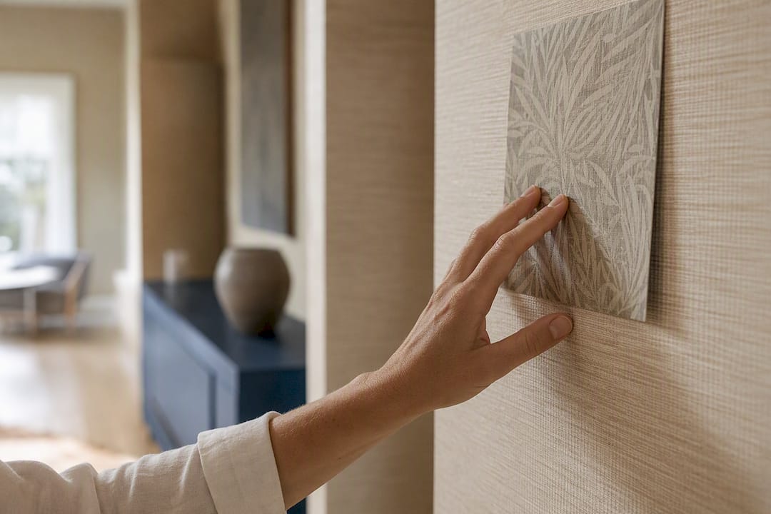
- Textured finishes like grasscloth or linen-effect papers need a hands-on inspection. Run your fingers across the sample; texture reads completely differently in a photo than under your palm, and these materials often carry specific, gentler cleaning instructions.
- Bathrooms and kitchens call for vinyl-coated or otherwise water-resistant options. A grasscloth swatch that feels luxurious in a dining room will not survive shower steam.
What Mistakes Should You Avoid With Wallpaper Samples?
The sample stage is where most expensive wallpaper regrets get built in, usually without anyone noticing until the rolls are already on the wall.
- Judging scale from a photo instead of the room. A pattern that looks perfectly proportioned on a laptop screen can overwhelm a small powder room. Always test at the real viewing distance.
- Ordering too few samples, or only one lighting condition’s worth of confidence. A single swatch checked once at noon isn’t a test, it’s a guess.
- Testing the wrong installation type. If you sample peel-and-stick but plan to install traditional paste, you haven’t actually tested your final product.
- Underestimating roll quantity. Designers consistently flag this as one of the most common wallpaper mistakes: add extra material to your calculated square footage to cover pattern matching and trimming waste.
- Tossing your sample or memo once installation starts. Keep it. If a section needs a repair or a future addition, that saved swatch is your only reliable way to match dye lot and batch later.
How Do You Coordinate Trim, Rugs, and Layered Patterns With Samples?
A sample isn’t just a wall test, it’s a color key for the entire room. Once you’ve settled on a wallpaper direction, hold that swatch up against your trim paint chips. Designers routinely pull the trim or ceiling color straight from the wallpaper palette rather than defaulting to builder’s white, and the result reads far more intentional.
Lay the sample beside your rug and upholstery swatches, too. A hand-knotted piece like the Lotto Hand-Knotted Wool Area Rug or the maze motif in the Selendi Hand-Knotted Wool Area Rug gives you a real textile to test pattern-on-pattern pairing against, rather than guessing how two prints will share a room.
- Vary pattern scale between wallpaper and textiles; keep the color family consistent so the eye has one thread to follow.
- Try a spare sample on the ceiling or inside a cabinet interior before committing. The ceiling-as-fifth-wall approach is one of the defining moves designers are leaning into for 2026.
- Check trim, doors, and casing together, since door and molding trends shift the framing around your paper more than most homeowners expect.
What Do Designers Actually Check on a Sample Memo?
Kevin O’Gara reads a memo the way an editor reads a contract: substrate first, repeat second, cleaning notes and installation type close behind. Skip any of those four items and you’re decorating on hope rather than information.
A sample only tells the truth if you read the whole memo, not just the pattern. Substrate and repeat predict how the paper behaves once it’s actually on your wall, not how it looks on a swatch card.
Kevin Francis Design requests both a peel-and-stick and a traditional paste memo whenever a new pattern is being tested for a client space, because the same print can read completely differently depending on finish. Pairing a wallpaper sample against a rug like the Cairene Hand-Knotted Wool Area Rug or a warm ceramic base like the 28" Augusta Orange Single Gourd Ceramic Table Lamp shows how color and scale hold up once real materials sit in the same frame.
How Do You Judge Wallpaper Texture and Quality in Person?
A photo can lie about texture more easily than it lies about color. Run your palm flat across the sample, then again with your fingertips, and pay attention to whether the surface has any grain, ribbing, or raised print you can actually feel. Grasscloth and linen-effect papers should have a natural, slightly uneven hand; if a “textured” sample feels perfectly smooth and flat, you’re likely looking at a printed texture illusion rather than the real material, which behaves differently over time.
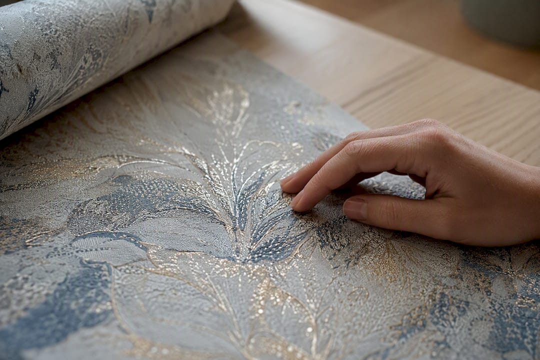
Hold the sample at a raking angle to a window or lamp. Light skimming across the surface reveals embossing, metallic flecks, or sheen variations that flat-on viewing hides completely. Flip the sample over and check the backing, too. A flimsy paper backing on a supposedly premium textured product is a warning sign the finished roll may not hang flat.
Check the print quality up close: are the pattern edges crisp, or slightly blurred where colors meet? Cheaper printing methods sometimes bleed at color boundaries, which becomes far more obvious once the pattern is repeated across an entire wall. Smell matters too, oddly enough. Some vinyl-heavy papers carry a chemical odor fresh out of the package that fades over a week or two; if it bothers you strongly on day one, factor that into your live-in test rather than dismissing it.
Finally, flex a corner gently. A quality substrate should hold its shape without cracking or curling excessively, a small but telling clue about how it will behave during actual installation.
How Do You Compare Multiple Wallpaper Samples Side by Side?
Comparing five or six swatches scattered across a table rarely works, because your eye jumps around without a fixed reference point. Instead, tape every candidate to the same wall in a single row, ideally with a few inches of breathing room between each one, so lighting and background stay identical across the comparison.
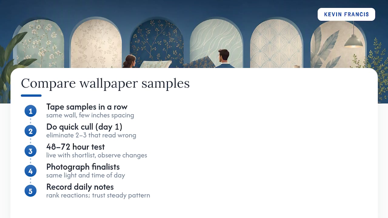
Narrow your field before you go deep. If you’ve ordered six samples, spend the first day eliminating the two or three that clearly don’t belong, whether the color reads wrong against your existing trim or the scale feels off the moment you step back. That leaves you with a shortlist worth the full 48 to 72 hour test rather than splitting your attention six ways.
Photograph the finalists together, side by side, in the same light, at the same time of day. This single habit does more to sharpen your decision than almost anything else, because side-by-side comparison shows relative warmth and saturation that your eye alone tends to smooth over when viewing one sample at a time.
Keep a simple notes file, digital or a scrap of paper taped to the fridge, ranking your reaction each day. Preferences shift as the novelty wears off, and the swatch you love on day one isn’t always the one you still love on day three. Trust the pattern that holds steady across multiple viewings and multiple lighting conditions over the one that only impressed you once.
How Do You Choose Colors and Patterns That Fit Your Existing Decor?
Start with what you’re not changing. Your sofa, your rug, your kitchen cabinetry, whatever stays put should set the boundaries for your wallpaper decision, not the other way around. Pull the two or three dominant colors from those fixed pieces and use them as your filter when narrowing sample options.
If your room already carries a strong pattern, a patterned rug, patterned drapes, keep the wallpaper’s scale intentionally different so the two don’t compete. A large-scale floral pairs more comfortably with a simple geometric rug than with another busy botanical. Consistency in color family matters more than matching every pattern exactly; a sage-and-cream wallpaper can sit beautifully beside a rug that leans more blue, as long as both share enough warmth or coolness to feel related.
Consider the room’s existing light and orientation, too. North-facing rooms with cooler, dimmer daylight tend to flatter warmer wallpaper tones, while south-facing rooms flooded with sun can handle cooler or more saturated patterns without feeling cold. Hold your sample against the room’s actual window light, not a lamp in a different room, before ruling anything out.
Don’t overlook furniture material either. Wood tones, whether a walnut console or a rattan piece like a woven table lamp base, read warmer or cooler depending on the wallpaper’s undertone sitting behind them, so test the pairing directly rather than trusting your memory of how the two “should” look together.
What’s the Best Way to Remove or Dispose of Wallpaper Samples?
Once you’ve made your decision, don’t just toss the losing samples in the trash immediately. Keep at least one full swatch, memo attached if you have it, in a labeled envelope or folder for at least a year after installation. If a section of wallpaper ever needs patching or a nearby room gets a coordinating update, that saved sample is your reference for dye lot and pattern positioning.
Removing a taped sample from drywall is usually simple: peel slowly at a low angle, and if any painter’s tape residue remains, a little rubbing alcohol on a cloth lifts it without damaging paint. Peel-and-stick sample swatches sometimes leave a faint outline on glossy paint if left up for weeks rather than days, so don’t extend your live-in test far beyond the recommended 48 to 72 hours on painted surfaces you care about.
For samples you’re genuinely finished with, most wallpaper swatches are paper or vinyl-coated paper, which typically goes in regular household trash rather than recycling, since the coatings and adhesive backing on peel-and-stick versions usually aren’t accepted by curbside paper recycling programs. If you ordered from a brand with a sample-credit program, double check whether they want unused swatches returned. Some do, as part of how that credit gets applied to your final order.
The Verdict on Sampling Wallpaper for a Designer-Confident Room
Most sampling advice stops at “tape it up and see.” That’s incomplete, and it’s why so many homeowners still end up with a wall they regret. The research backs a more disciplined process: read the memo like a technical document, test through a full light cycle, and hold judgment until the second week. Skip any one of those steps and you’re not really testing, you’re hoping.
What’s overrated in most guides is the emphasis on quantity, ordering a dozen samples rarely beats ordering four or five and testing them properly. What’s underrated is pairing. A wallpaper swatch tested alone tells you half the story; held against a rug, a lamp base, or your actual trim color, it tells you whether the room will feel finished or merely decorated.
If you take one thing from this, prioritize the live-in window over the visual impression. Confidence in a pattern that survives three days of real light beats confidence in a swatch that only impressed you for thirty seconds in a showroom.
— Kevin O’Gara
Get Designer-Matched Samples and Pairing Help From Kevin Francis Design
A big-box wallpaper aisle gives you a rack of swatches and no one to ask when the pattern scale looks wrong against your rug. Kevin Francis Design gives you both the sample and someone who’s already thought through how it pairs, without the cost or wait of hiring a separate design firm.
Once you’ve tested a pattern direction, requesting a larger memo or asking about substrate and installation type is as simple as reaching out through the site’s design services contact. If you’re coordinating a full room, start with the pieces that anchor a scheme: a hand-knotted rug like the 4x6 Anatolia Hand-Tufted Blue Maze Rug, a customizable option like The Talisman Rug, or a warm lighting accent like the 22" Lillian Woven Rattan Wicker Table Lamp or the 26” Frances White Ceramic Dot Table Lamp. Bring your taped wallpaper sample alongside any of these, and you’ll see the full room take shape before a single roll gets ordered. Browse the current rug and lighting collection or reach out to schedule a design consultation and start pairing your sample the way a professional would.
Sources
- The Biggest Wallpaper Trends for 2026, According to Designers
- How to read a wallpaper memo — what that sample is telling you before you order
- The Wallpaper renaissance: pattern and texture transforming interiors
- 6 Wallpaper Mistakes You Should Always Avoid, Designers Say
- Wallpaper Samples Guide: Why, How, and What to Expect | Houston Wallpapering
FAQ
Can You Get Wallpaper Samples for Free?
Many brands offer a set number of free swatches before charging a small fee, and some apply that fee as credit toward your final roll order, so it’s worth asking about the specific policy before you request anything.
What Is the Wallpaper Trend for 2026?
Designers are favoring tactile, nature-inspired patterns like moody florals and reduced-scale heritage motifs, along with textured finishes and ceiling applications as the “fifth wall” design surface.
What Are Common Mistakes to Avoid When Choosing Wallpaper?
The biggest ones are miscalculating roll quantity, misjudging pattern scale, poor wall prep, and using the wrong adhesive for your installation type, so always add extra material and test scale at real viewing distance.
Where Can I Find Wallpaper Samples?
You can request samples directly from a brand’s website, order a larger memo when the pattern repeat is big, or explore designer-curated options like the peel-and-stick collection from Kevin Francis Design for guided pairing help.


