Modern Chandeliers for a Midtown Townhouse
This project was produced in partnership with Hudson Valley Lighting.

One of the most impactful updates you can make to an interior is lighting, because not only do light fixtures make a sculptural statement, they also change how the room feels from the way they disperse light throughout the space. When both elements come together to transform a room, it's so satisfying! I knew that updating the light fixtures in the Westside Project living and dining room would be so key to setting the stage in the whole home for the new design scheme. I turned to Hudson Valley Lighting for some stunning modern chandeliers to set the tone for the townhouse design and provide the perfect pairings to the home's industrial architecture. See how the Liberty sputnik chandelier and linear Bowery chandelier complement each other perfectly in the living and dining spaces below!


The living room in the townhouse is a double-story space with a floor-to-ceiling window, so we needed a fixture in here to balance the larger proportions of this room. While the window brings in incredible light during the day, the space gets very dark at night in the top of the room since there was no lighting from above, so I knew the Liberty chandelier would be perfect in both scale and functionality with bulbs around the entire sphere, to illuminate the space in every direction.


I love that you can see the chandelier from outside the townhouse at night, perfectly framed in the window, and there's a gorgeous view of the fixture from the loft above the living room. The sputnik design is the perfect space-age pairing for the room which features some of my mother's beloved antiques, which always benefit from the juxtaposition with a more contemporary element.

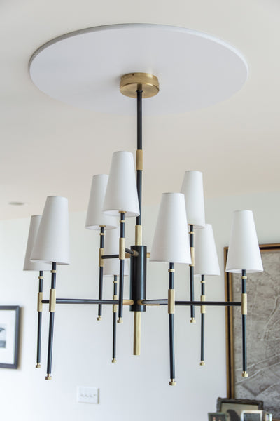
With an open floor plan, it was important that the two light fixtures complemented one another, without matching perfectly. I love how the linear lines of the Bowery chandelier coordinate with the living room chandelier, with gold accents on both fixtures to warm up the contrast of black-and-white throughout the house. For softer, diffused lighting in the dining room (much more flattering for dinner party guests!), I chose a chandelier with shades. Also importantly, I ensured the piece was large enough to balance the size of the oval tulip table below.

I love the subtle fluted detail on this chandelier and how the black and gold elements pair with the antique dining chairs below and the frame on the oversized map of Paris that hangs above the buffet. We hung the chandelier on a super simple ceiling medallion to keep to the home's clean lines and modern bones.
I couldn't be happier with the impact of the stunning modern chandeliers from Hudson Valley Lighting in the most used spaces in the Westside townhouse. They truly transformed these rooms, making them more beautiful AND more livable with key changes to the lighting in each space. I can't wait to share more design updates from this project... the living room scheme is about to look a lot different – the chaise was picked up by the upholstery shop this week!
xoko
Browse by Category

No.1
Design Projects
Explore interiors from client work and personal renovations — layered, livable, and always in progress.
read more →
No.2
Collaborations
From product launches to styled spaces, discover the brand stories I’ve helped bring to life.
read more →
No.3
The Notebook
A growing archive of iconic designers, inspiring artists, and unforgettable design moments.
read more →
No.4
Travel by Design
Wander with a designer’s eye — from charming hotels and city guides to visual inspiration abroad.
read more →
the Weekly Edit

