This project was produced in partnership with DHP Furniture, Home Depot, Josh Young, Rebecca Atwood, and St. Frank.
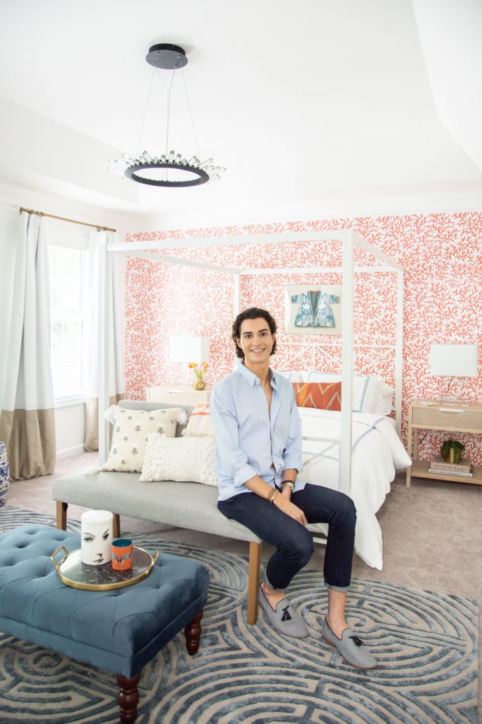
This week was the opening of the Make It Home showhouse with Invitation Homes here in Atlanta, and I couldn't be more proud of the way the house came out! It was an collaboration with design influencers from the Atlanta area, lead designer Emily Henderson, and the amazing Invitation Homes team which made the project so much fun. I designed the master bedroom, which you might remember from the design board I published a few weeks ago. I'm thrilled to share the final room reveal, with all of the great details that make up this layered space. It's full of lease-friendly design tips like removable wallpaper, a mix of color and pattern, LED lighting, and smart home features. I channeled modern Southern style, which features a foundation of classic design elements updated with a fresh twist.
All of the designers working on the show house put together a design forecast for this project, highlighting design tips that they implemented in their own rooms. My tip was reimagined lighting, and the amazing LED chandelier in my room was the perfect example. Without lightbulbs, fixtures can be so interesting, and the crystals on this piece made it extra special.
One of the most striking parts of the room is the removable wallpaper accent wall behind the bed, which brings in a warm, energizing coral red to complement the soothing blue hues in the bedding and rug. The wallpaper was super easy to apply, especially because the busy pattern helped hide the seams between panels. I tied the coral into the room's color palette with the beautiful chevron kilim lumbar pillow on the bed and the striped throw blanket on the bench.
The amazing thing about this canopy bed is that it's one of the most affordable pieces in the room! This bedframe from DHP Furniture has a very simple design, making it a timeless piece that blends so easily with the mix of styles in the room. I topped it with a Signature Sleeps mattress that's handmade in California with organic materials. It's incredibly soft!
I'm in love with the Greek key border detail on the bedding! The beautiful blue infant Ikat robe from St. Frank Textiles was one of my favorite finds – it was handmade in Uzbekistan and adds such a unique touch above the bed, framed in lucite.
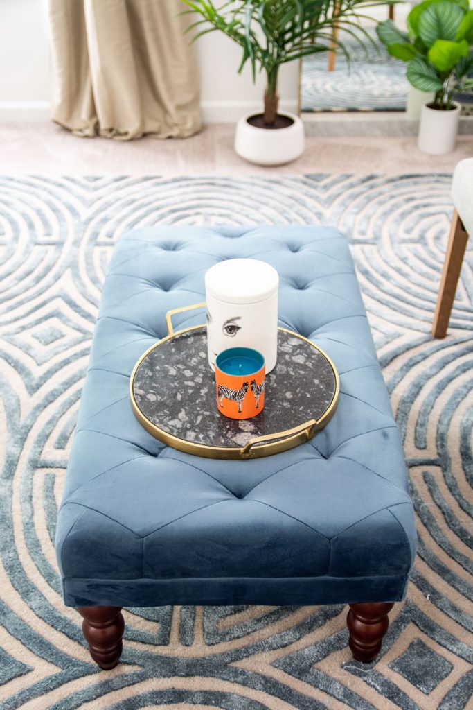
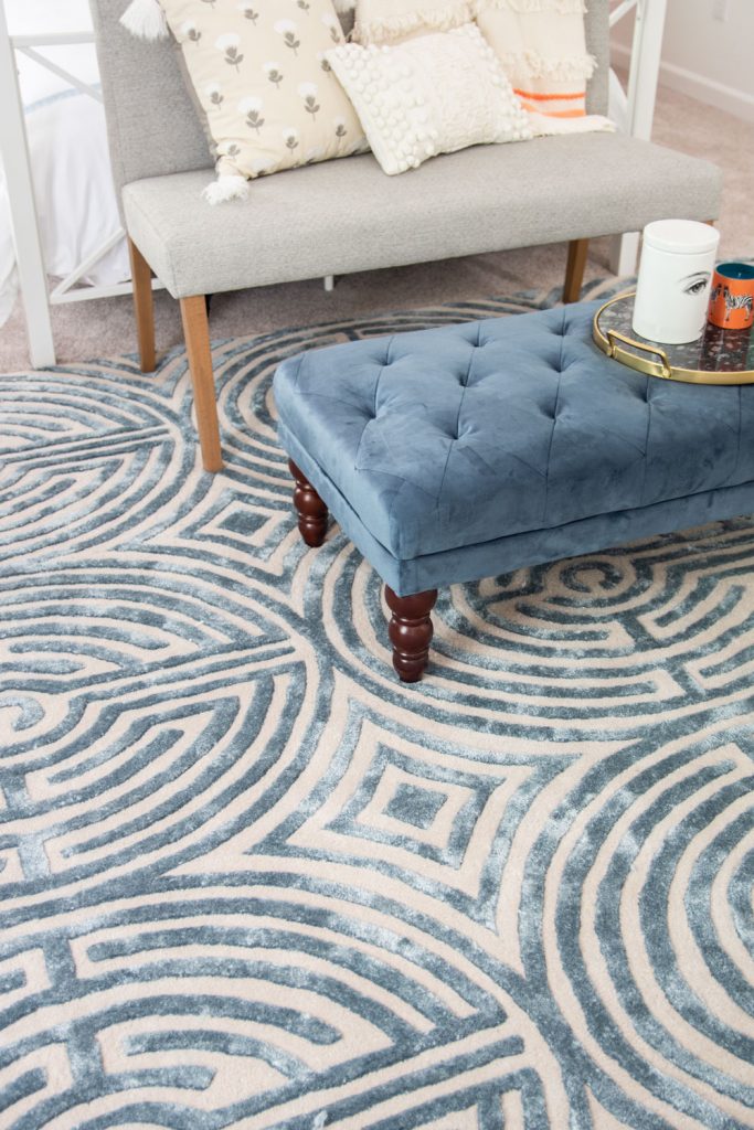
You might remember from my install sneak peek that the ottoman was at the end of the bed – the bench was a super last minute addition that I added to fill in the space between the bed and dresser and add some additional functionality to the room. It provides a great place to sit and read, relax, tie your shoes, or lay out an outfit for the next day. Plus, it provided an opportunity to bring in some additional details with pillows and a blanket. I paired it with the tufted ottoman, which was the perfect shade of blue for my rug and adds a traditional touch to the room with its vintage-inspired design from The Novogratz's furniture collection.
A full-length mirror is key to any bedroom, but this marble and brass floor mirror was an especially key piece in the bedroom, from adding a sleek modern edge to the space to reflecting additional light into the room. Large mirrors like this can feel like an additional window in a room, and this one was the perfect size to anchor the wall with a few plants and a chinoiserie garden stool for a nice contrast.
One of my favorite parts about the room was the fact that I was able to incorporate one of my very own rugs! I was so excited to unroll the Lucca rug in an 8x10 size, because the pattern repeats on this larger size making an amazing pattern. The sky blue colorway was so perfect for this space and the rug is so incredibly soft.
Josh Yöung creates the most amazing artwork and I was thrilled to bring his portrait art into the bedroom! These pieces perfectly represent the blend of old and new and looked so fabulous above the campaign dresser. I chose the Classical Group a set of four, but there are so many great portraits you can choose from in his collection.
I brought in a few key pieces to the bathroom to amp up its style, including a classic cane-back chair for the vanity and these monogrammed towels from Weezie that I adore. The more modern monogram is perfect for the master suite and they added a really personal touch to the design.
I'll be sharing a full tour of the showhouse next week on the blog, but in the meantime you can check out the rest of the designers' blogs for their amazing room reveals: Emily Henderson of Style by Emily Henderson Erin Marshall of Live Pretty on a Penny Brittni Mehlhoff of Paper and Stitch Brittany Hayes of Addison’s Wonderland Rhoda Vickers of Southern Hospitality I'm so grateful to have been part of this project – my very first showhouse! It's been incredible to see one of their rental homes come to life through lease-friendly design. With homes in over 17 markets across the country, you can check out their high-quality, updated homes available for lease on the Invitation Homes website!
- Kevin
Join our world of New Regency style
Get on the list for design inspiration, project launches, and exclusive sales:
Whether you're building a new house or refreshing your living room, Atlanta interior designer Kevin Francis O'Gara can help you bring your vision to life.