This project was produced in partnership with AllModern.

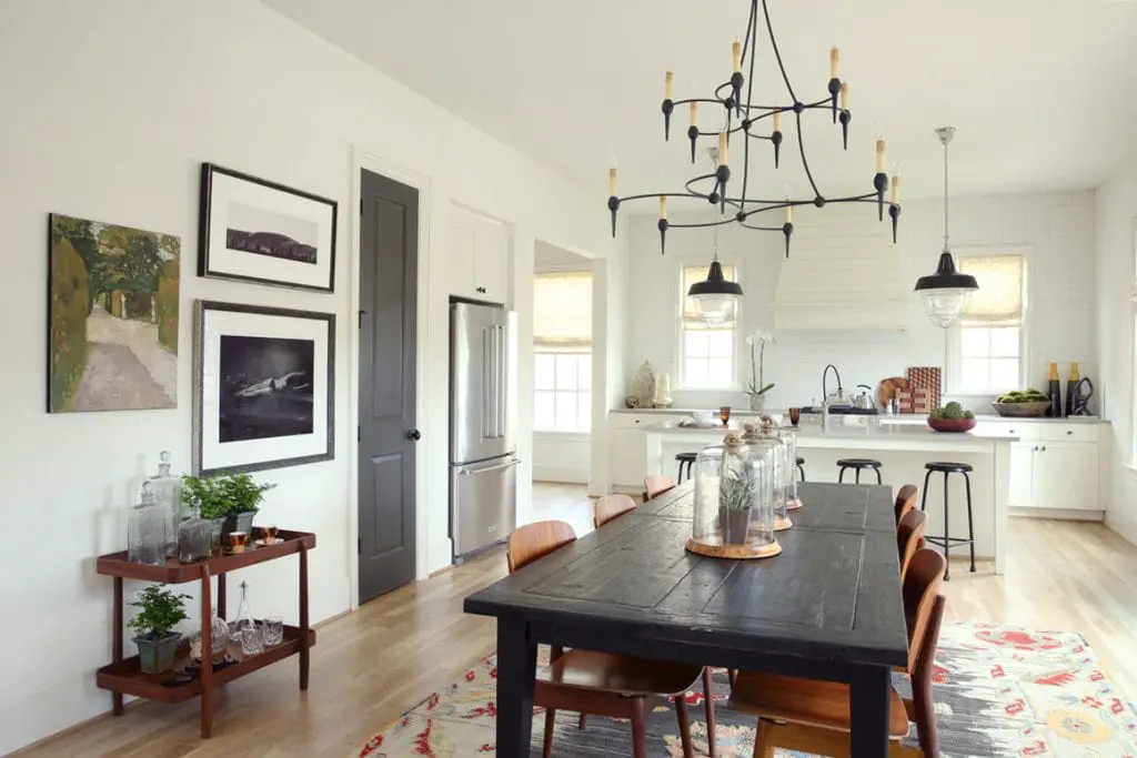
I've had the pleasure of working with Hedgewood Homes over the past year as a social media director and manager of their luxury furnished rentals here in my neighborhood in Atlanta for their brand Hedgewood Stay. The houses are beautifully appointed by Hedgewood co-founder Pam Sessions, so I was thrilled to get a chance to collaborate on the "Telfair" rental to design a light and bright dining room refresh with decor from AllModern. I sourced new dining chairs, sculptural vases, framed artwork, and modern accessories to give the space a new look. Check out the before and after and all the new design details below!
Before After
After

It's amazing how much impact just a few key pieces can make. There's one super subtle change that I wanted to point out – the candelabra covers on the chandelier got swapped to white sleeves to help tie in the new decor. It's a small swap but it made such a big difference!


The new dining chairs are a classic wishbone silhouette but are a bright white finish with wooden legs. There are lots of color options to choose from on this chair but I love how the white gives a crisp contrast to the black dining table.

These round vases are one of my favorite finds! They have a simple, sculptural shape and are a great size. The finish has a subtle speckled texture and they are beautiful in a set. I lined three down the table for an easy centerpiece.

Above this mid-century stacked side table, I swapped out the old artwork for some fun new pieces from AllModern's collection. This set includes a framed photography print by Andy Warhol, a great landscape of an chrome airplane, a colorful photograph of hanging laundry, and a camel print by Pablo Picasso. I mixed black and gold frames to warm up this vignette and tie in the gold decor below.

On the cart below, I mixed in a few new accessories to modernize the look. A simple brass lantern adds height on a stack of books, and the gold leaf loop sculpture brightens the lower shelf with a hint of metallic.

This Crashing Waves photograph is a beautiful addition to the opposite wall. Black and white artwork is always classic, and high-contrast pieces like this make a great impact because they've got lots of texture and visual weight. This piece can easily stand alone on its own wall, and ties in with the airplane photograph on the other side of the room.

On the tray table in the corner, I added another gold and glass lantern and an agate slice on a stand for another touch of gold. I love how bright the dining room looks with these simple, contemporary additions from AllModern. It's incredible what just a few changes can do for a space. Artwork is a great place to start, so check out the whole collection for more inspiration, and find more modern dining room furniture here. I hope this bright dining room refresh inspires your own next decorating project!


