6 Common Home Decor Mistakes and How to Avoid Them
Decorating your home is a deeply personal and creative process, but even the most enthusiastic decorators can fall into common traps that diminish the space's potential. Whether it's selecting the wrong paint color, overcrowding a room with furniture, or neglecting lighting, these missteps can impact the overall ambiance and functionality of your home. By understanding these typical errors and learning how to avoid them, you can transform your living space into an inviting and harmonious environment that truly reflects your personal style. In this guide, we'll explore some of the most frequent home decor mistakes and provide practical solutions to help you create a more cohesive and appealing interior.
Wall Art Selection
Wall art is a powerful tool for adding personality and visual interest to a room, but it can also be a tricky element to get right. One of the most common mistakes people make when selecting wall art is choosing pieces that are too small for the space. This can result in an underwhelming and disproportionate display that doesn't do justice to the artwork or the room itself. To avoid this mistake, consider choosing larger pieces or creating a gallery wall with multiple smaller pieces to fill up the available space.
When it comes to hanging wall art, another common mistake is placing it too high. As a general rule, the center of the artwork should be at eye level or slightly above for optimal viewing. Avoid placing wall art too far away from other elements in the room; otherwise, it can look disconnected and out of place. The experts at Canvas n' Decor note that paying attention to scale and placement is key to creating a visually appealing display of wall art. It's also essential to consider the overall aesthetic and color scheme of the room when selecting wall art pieces to ensure they complement and enhance the space, rather than clash with it.
Overcrowding with Furniture
Arranging furniture is a balancing act that involves both utility and aesthetics. One frequent pitfall is overcrowding a room with too much furniture, which can make even a spacious area feel cramped and cluttered. This mistake often arises from a desire to include various seating and storage options without considering the room's natural flow. When a room is packed to the brim, it becomes difficult to navigate, and the furniture overshadows the architectural features.
To avoid overcrowding, prioritize essential pieces and consider the scale of each item in relation to the room's size. Multifunctional furniture, like ottomans that double as storage or sofa beds, can offer solutions without overwhelming the space. Leave enough wiggle room to ensure free movement and focus on a few key pieces that serve both functional and stylistic purposes. Creating a map of your room's layout can help visualize and plan an efficient use of space.
Ignoring Lighting
Lighting is one of the most crucial yet underestimated elements in home decor. Insufficient lighting can make a room feel drab and uninviting, while overly harsh lighting can be uncomfortable and stark. One common mistake is relying solely on a single light source, such as an overhead fixture, which can lead to shadowy corners and an unbalanced atmosphere.
To rectify this, incorporate a layered lighting approach that includes ambient, task, and accent lighting. Use floor lamps, table lamps, and wall sconces to distribute light evenly while offering flexibility to suit different activities and moods.
Skipping Rug Placement
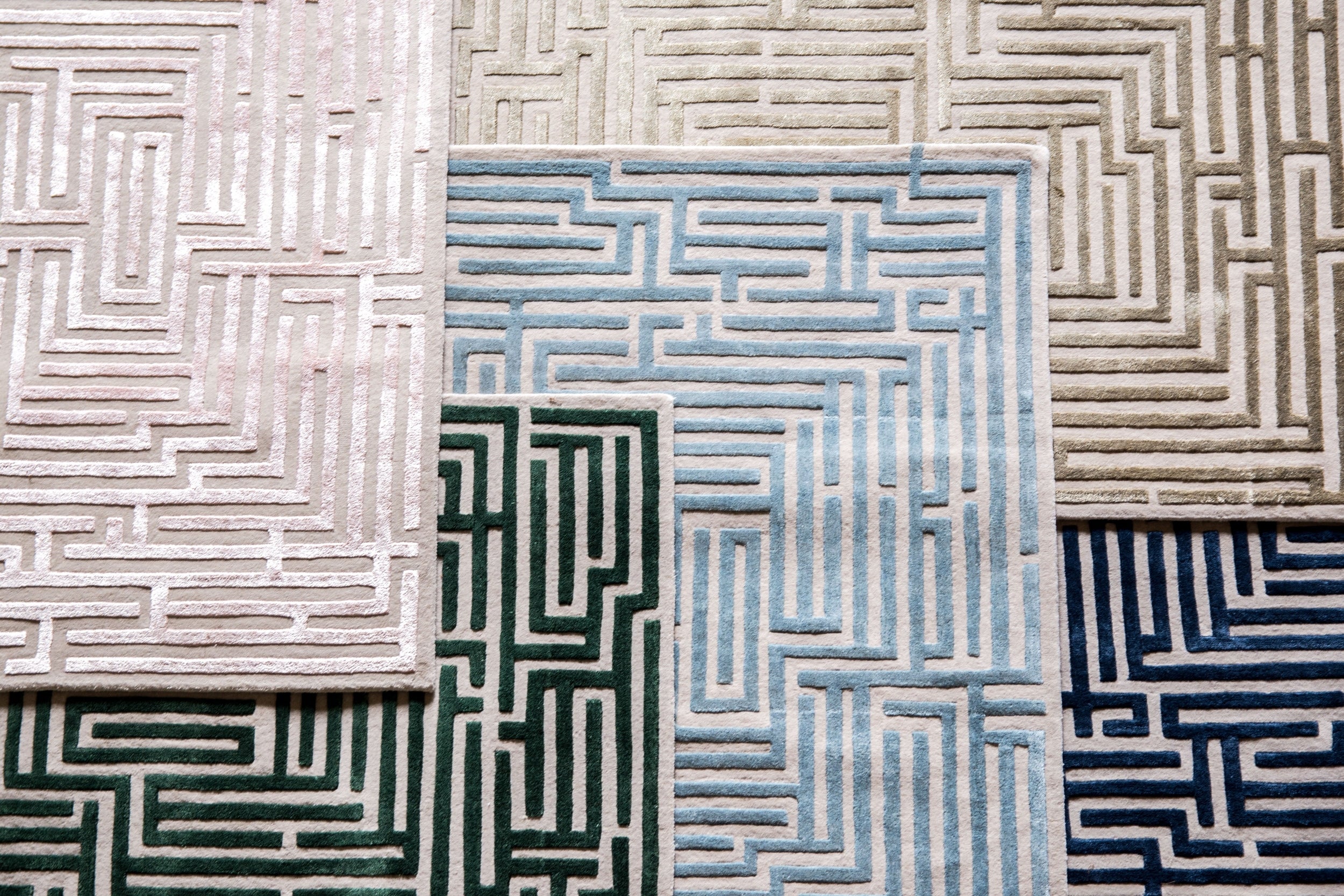
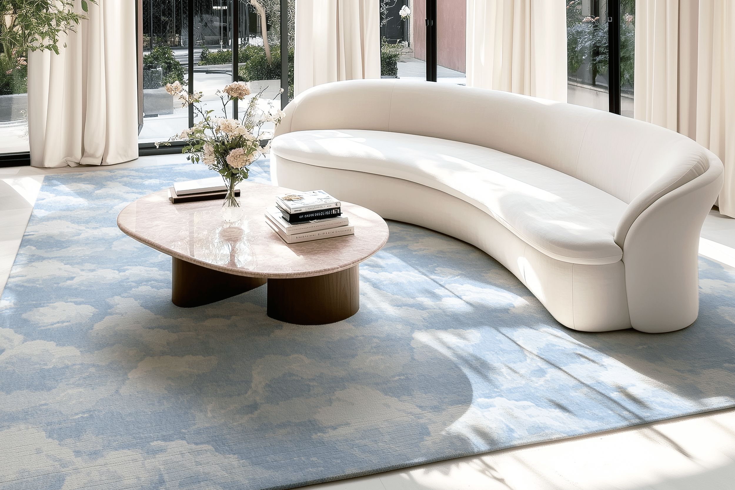
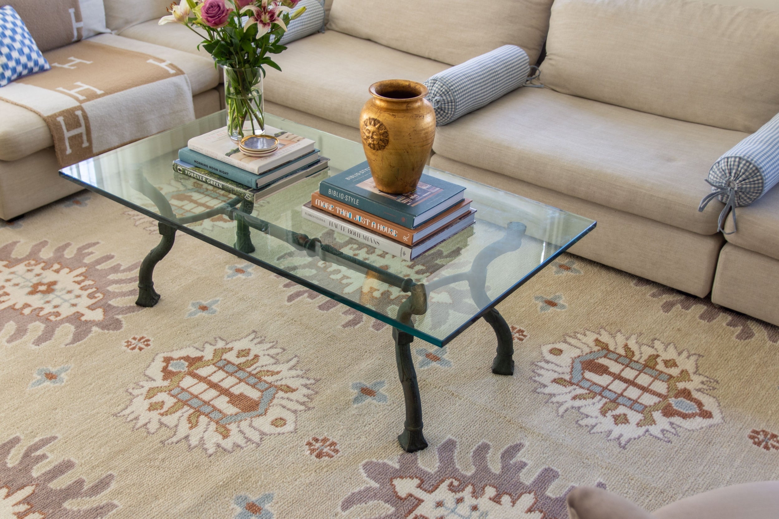
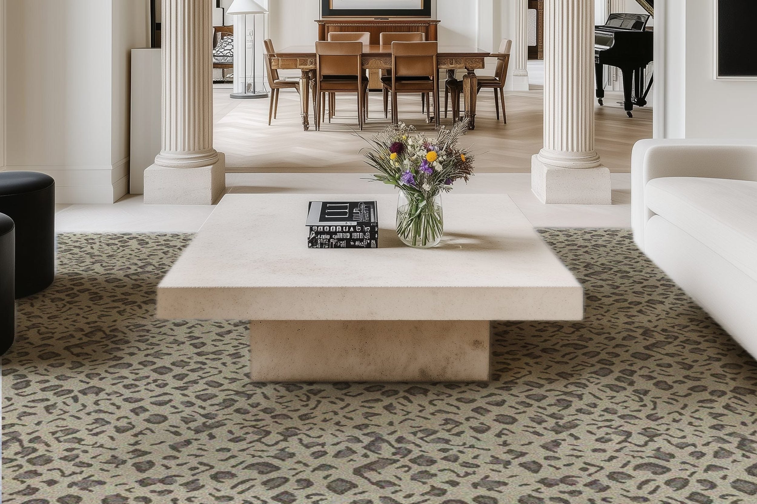
Rugs serve multiple purposes beyond just covering the floor; they contribute to the room's warmth, define spaces, and add texture. A common mistake is choosing a rug that is too small, which can disrupt the visual balance and make the room appear disjointed. Rugs that are too tiny seem like an afterthought rather than a cohesive part of the design system.
Opt for a rug that is large enough to anchor the key pieces of furniture in a room. For example, in a living room setting, all furniture legs should at least touch the rug, while in dining areas, the rug should extend well beyond the back legs of chairs when they're pulled out.
Neglecting Functional Decor
In the quest for aesthetic appeal, functionality can sometimes take a back seat in home décor, leading to spaces that are beautiful but impractical. For example, opting for chic yet uncomfortable dining chairs or decorative items that quickly accumulate dust and clutter. Functionality doesn't have to compromise style, and the two should coexist harmoniously.
To avoid this mistake, choose decor pieces that serve dual purposes. For instance, decorative baskets can be used to store throw blankets or magazines, while beautiful trays can display decor items neatly and contain smaller accessories.
Disregarding Cohesiveness
An interior that lacks cohesiveness can feel chaotic and unsettling. One of the pitfalls here is an inconsistent color scheme or theme that doesn't flow naturally from room to room. It's easy to be tempted by diverse styles and colors, but without a unifying element, the decor might become disjointed and overstimulating to the eye.
To achieve cohesiveness, select a color palette or theme and steer the design choices around these anchor elements across all rooms. Subtle variations within the chosen scheme can add both unity and variety, allowing for individual expression without losing overall harmony.
Decorating your home is a process of trial and error, and it's natural to make mistakes along the way. However, by being aware of these common pitfalls and taking steps to avoid them, you can create a beautiful and functional living space that truly reflects your personal style. With a little bit of planning and attention to detail, you can transform your home into a welcoming haven that you'll love coming back to every day.
Browse by Category

Design Projects
Explore interiors from client work and personal renovations — layered, livable, and always in progress.
read more →
Collaborations
From product launches to styled spaces, discover the brand stories I’ve helped bring to life.
read more →
The Notebook
A growing archive of iconic designers, inspiring artists, and unforgettable design moments.
read more →
Travel by Design
Wander with a designer’s eye — from charming hotels and city guides to visual inspiration abroad.
read more →


